


 This topic is locked

 1 votes
VisionaryGaming.com Logo Competition **EXTENDED DEADLINE**
Started by
DijonWolfie
, Jan 17 2007 09:16 AM
120 replies to this topic
#41

Brown_Cow
-

- Members
-

- 18 posts
Young Padawan
- Location:Tazzie, Australia
Posted 22 January 2007 - 06:36 AM
Thanks man, here's a variation with a more pronounced V in the eye.
#42
DijonWolfie
-
- Members
-
- 45 posts
Young Padawan
- Gender:Male
- Location:Worcestershire, England
Posted 22 January 2007 - 08:00 AM
That's very nice! Strangley enough my company is called M'eye studios and I would be infact interested in taking this logo as a logo for that as apposed to using it for the VG project, could you have a go at inserting an M into the eye without killing the affect?
Edited by DijonWolfie, 22 January 2007 - 08:02 AM.
#43
Ben
-

- Publishing Betazoids
-
- 1,366 posts
P2L Jedi Master
- Gender:Male
- Location:VIC, Australia
Posted 22 January 2007 - 08:25 AM
Ok, so now I know not to make it too technicalI think My favourite of your entries, D4rk is your 3D V in green however these VG's are also affective

By the way, brown_cow that logo is great. Though if you dont mine me saying the eye is a little blurry, or is that just the anti-alias? Anyway, great job on the logo.
EDIT: eh, dunno why I'm entering this...
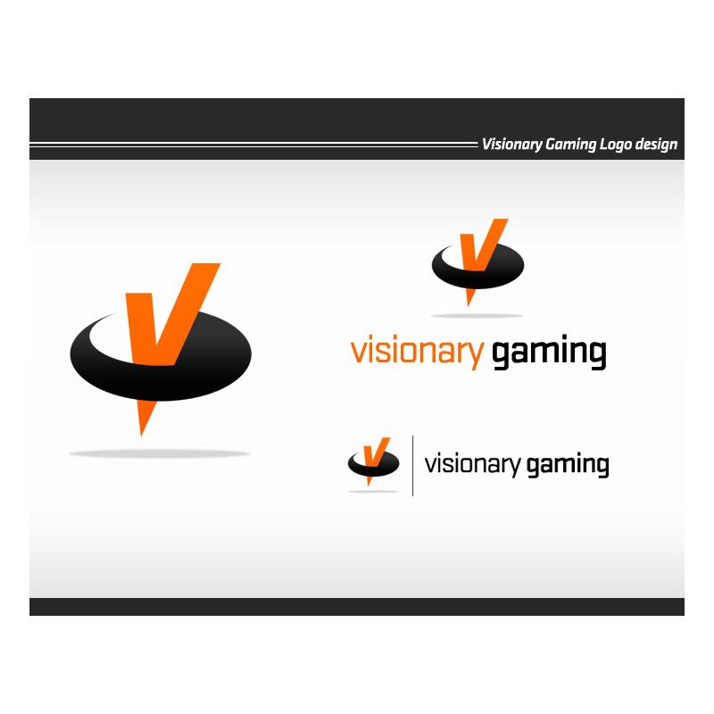
 visionarygaming7.jpg 49.39KB
136 downloads
visionarygaming7.jpg 49.39KB
136 downloadsEDIT 2: Here's another one to make up for such a bad last entry
visionarygaming8.jpg 56.06KB
126 downloads
Edited by d4rkst0n3, 22 January 2007 - 08:47 AM.
#44
DijonWolfie
-
- Members
-
- 45 posts
Young Padawan
- Gender:Male
- Location:Worcestershire, England
Posted 22 January 2007 - 09:03 AM
The bottom one looks like an 80's iTV logo!
I think I prefered your earlier versions
I think I prefered your earlier versions
#45
Babyface
-

- Members
-
- 66 posts
Young Padawan
Posted 22 January 2007 - 04:25 PM
Well I have been trying loads of lame designs, but none convinced me. This is the only one that looked alright to me, I think it is a little more professional.
Attached Files
-
 vsgaming3.png 20.98KB
73 downloads
vsgaming3.png 20.98KB
73 downloads
#46
Ben
-
- Publishing Betazoids
-
- 1,366 posts
P2L Jedi Master
- Gender:Male
- Location:VIC, Australia
Posted 22 January 2007 - 07:16 PM
Yeah so did I, but I don't really have any more idea's for the whole 3D look...The bottom one looks like an 80's iTV logo!
I think I prefered your earlier versions
#47
Brown_Cow
-
- Members
-
- 18 posts
Young Padawan
- Location:Tazzie, Australia
Posted 22 January 2007 - 07:31 PM
Yeah, It might be possible, but as you say it may not look as effective as a V. I'll give it a go.That's very nice! Strangley enough my company is called M'eye studios and I would be infact interested in taking this logo as a logo for that as apposed to using it for the VG project, could you have a go at inserting an M into the eye without killing the affect?
d4rkst0n3 Wrote:
By the way, brown_cow that logo is great. Though if you dont mine me saying the eye is a little blurry, or is that just the anti-alias? Anyway, great job on the logo.
Yeah thanks man, that chunky pixellated look was on purpose, to give the idea of graphics being involved. I might to a variation without the pixellation.

#48
Ben
-
- Publishing Betazoids
-
- 1,366 posts
P2L Jedi Master
- Gender:Male
- Location:VIC, Australia
Posted 22 January 2007 - 07:39 PM
Oh no what I meant was the edge of the pixels look a little blurry, though I really don't see any problem with itd4rkst0n3 Wrote:
By the way, brown_cow that logo is great. Though if you dont mine me saying the eye is a little blurry, or is that just the anti-alias? Anyway, great job on the logo.
Yeah thanks man, that chunky pixellated look was on purpose, to give the idea of graphics being involved. I might to a variation without the pixellation.
Here's another logo:
visionarygaming9.jpg 55.52KB
145 downloads(Man this is my 9th logo for this competition)
#49
Brown_Cow
-
- Members
-
- 18 posts
Young Padawan
- Location:Tazzie, Australia
Posted 22 January 2007 - 09:41 PM
Here's the variation for M' eye Studios. 

#50
Ben
-
- Publishing Betazoids
-
- 1,366 posts
P2L Jedi Master
- Gender:Male
- Location:VIC, Australia
#51
Bug
-

- P2L Staff
-
- 3,611 posts
P2L Staff
- Gender:Male
- Location:Perth, Australia
Posted 24 January 2007 - 07:08 AM
Far out time flies...  I don't think I'm going to be able to get into this one. So much stuff to do... and it's the holidays? Far out lol. Good luck to whoever wins!
Oh and by the way: Darkstone, you're creating some of the best logo's I've ever seen!
I don't think I'm going to be able to get into this one. So much stuff to do... and it's the holidays? Far out lol. Good luck to whoever wins! Oh and by the way: Darkstone, you're creating some of the best logo's I've ever seen!
#52
PixelHiveDesign
-

- Members
-
- 83 posts
Young Padawan
- Gender:Male
Posted 24 January 2007 - 10:00 AM
Here is my entry. I have a few other versions of this design with varying styles but this one stood out.

#53
Discontinuity
-

- Members
-
- 63 posts
Young Padawan
Posted 24 January 2007 - 04:20 PM
i'm away til the 29th. you might want to extend the competition a few days as NothingMan hadn't seen this until I pointed him in the direction of it - he might give darkstone's design a run for the money!
#54
DijonWolfie
-
- Members
-
- 45 posts
Young Padawan
- Gender:Male
- Location:Worcestershire, England
Posted 24 January 2007 - 04:57 PM
I had already considered this, seems like it had fallen into a crack! I think I shall give till the 5th of February. Appologies to those who rushed, but all these designs are very good!
#55
NothingMan
-

- Members
-
- 132 posts
Young Padawan
- Location:Banovici, Bosna i Hercegovina
- Interests:Im a logo designer, my expertise is branding. I do templates too, but I suck at coding :). I do little photography as well...:)<br />Thats all
Posted 24 January 2007 - 07:27 PM
Hello there ,
Nice you remembered me guys.
If I happen to win, blame discontinuity
Now for real, here are my concepts, I didnt have the time to provide color variations as I thought the deadline was due tomorrow...
Feedback is always more than appreciated

,Nice you remembered me guys
.If I happen to win, blame discontinuity
Now for real, here are my concepts, I didnt have the time to provide color variations as I thought the deadline was due tomorrow...
Feedback is always more than appreciated
#56
Bug
-
- P2L Staff
-
- 3,611 posts
P2L Staff
- Gender:Male
- Location:Perth, Australia
Posted 24 January 2007 - 07:42 PM
NothingMan, your design first design has just blown me away! What an entry!! Looks like Darkstone's going to have a hard time with that
Sweet!! We have until the 5th of Feb... I'll be sure to enter something soon
Sweet!! We have until the 5th of Feb... I'll be sure to enter something soon
Edited by Bug, 24 January 2007 - 07:42 PM.
#57
legendaryfox
-

- Members
-
- 48 posts
Young Padawan
Posted 24 January 2007 - 08:15 PM
Wow, stuff here looks pretty sweet. I guess I'll enter, as an underdog. I like darkstone's simple yet effective cubish designs - really does make it 'visionary' Thanks for extending deadline!
I'll see what I can crank out.
Thanks for extending deadline!I'll see what I can crank out.
#58
Ben
-
- Publishing Betazoids
-
- 1,366 posts
P2L Jedi Master
- Gender:Male
- Location:VIC, Australia
Posted 24 January 2007 - 09:07 PM
Ahh sh.. I mean, welcome to the comp NothingMan! 
Lol, nah you have some amazing entries there. I'm gonna have to really try hard on this one
Lol, nah you have some amazing entries there. I'm gonna have to really try hard on this one
#60
Bug
-
- P2L Staff
-
- 3,611 posts
P2L Staff
- Gender:Male
- Location:Perth, Australia
Posted 25 January 2007 - 04:21 AM
That's looking better, Babyface!! Keep improving like that and you'll have a good chance!


0 user(s) are reading this topic
0 members, 0 guests, 0 anonymous users

