Jump to content


Photo
- - - - -

"Forging the Athlete" - Newsletter logo contest- $20


  • This topic is locked This topic is locked
31 replies to this topic

#1 AdventureBear

AdventureBear

    Young Padawan

  • Members
  • Pip
  • 41 posts

Posted 12 April 2007 - 11:41 PM

Hi all. YOu guys did a fantastic job of submitting entries for my contest last fall for logo for my endurance sports coaching company, Steel City Endurance. The winning logo was made by NothingMan, the guru of logos!

I am currently offering $20 to a winner from this site if I like the logo even vaguely. But if there are only 1-2 piss poor entries, no dice. I'm sure great entries from you guys won't be a problem. Ask NothingMan, I am good for the payment, and it may get you more work...I've referred 3 people to his so far!

What I need:

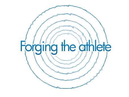
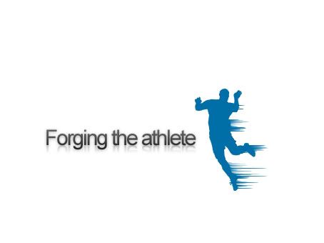
A logo or banner to be used in the header of my email newsletter titled "Forging the Athlete". The newsletter will have articles on training for sports like mountain biking, cycling, triathlon and running. The name is a play on my company name, Steel City Endurance. Click on my site to see the current logo.

I have in mind some type of theme involving an athlete being created out of raw materials, like forging steel. During my logo contest last fall, someone had a similar entry with a kettle pouring molten steel into one of the letters of the name...I didn't really like that specific instance, but a similar idea would be cool. I would prefer it to be horizontally oriented flowing from left to right. In otherwords, if there is movement of the figure or athlete, it should be from left to right. No clip art or copyrighted images. It can have a transparent background, or be part of a banner style that would get placed at the top of the newsletters.

The winner should supply
A color version and a black and white and/or grayscale version.

File types:
jpg as well as original layered eps or psd files if possible.

Closing date :
4/30/7. I may close it sooner if there is a clear winner, I'll give a warning of 2-3 days if that's the case.

Winner will recieve :
US $20 via PayPal (no wire transfers). :biggrin: If the winner does not have paypal, I can also send a check via US Snail mail.

Thanks a bunch!
Suzanne
www.steelcityendurance.com

Edited by AdventureBear, 13 April 2007 - 12:15 AM.


#2 Matheus

Matheus

    P2L Jedi Master

  • Members
  • PipPipPipPip
  • 1,058 posts
  • Gender:Not Telling

Posted 16 April 2007 - 11:45 AM

Im not like disconsidering your competition
but don't you think 20$ might be too small for this?
I mean, a logotype/corporate identity costs around 100$ ~ 300$

Edited by Matheus, 16 April 2007 - 11:45 AM.


#3 bÆko

bÆko

    Jedi In Training

  • Members
  • PipPip
  • 477 posts

Posted 16 April 2007 - 03:12 PM

Matheus, at a professional graphic company maybe. We are nothing but a bunch of kids playing in photoshop. 300$ would be too stupid. I will enter this if i have time..

#4 AdventureBear

AdventureBear

    Young Padawan

  • Members
  • Pip
  • 41 posts

Posted 16 April 2007 - 06:38 PM

I'm well aware of what it would cost to hire a professional. This is not a corporate identity, it's for a newsletter. I did the Logo contest for $50 and had more than a dozen great entries. I have also recommended this site to 2 friends who held contests offering between $40 - $75 for the winning prize. You guys rock which is why I post and lurk here. I've referred 1 additional friend to NothingMan independant of this board, and referred yet one more friend to this board who hasn't posted here yet. This is a networking site for you guys as much as anything else. Great marketing...and it's free. Do you know how much it would cost to advertise your services to try and get new clients? Word of mouth is the way to go. If you've outgrown the training ground offered here, more power to you, I know that all of you will be very successful in your projects outside of this forum

This newsletter contest is $20. If you think it's worth your time then enter. If you don't then move on to the next contest, your choice! :angry:

Edited by AdventureBear, 16 April 2007 - 06:40 PM.


#5 AdventureBear

AdventureBear

    Young Padawan

  • Members
  • Pip
  • 41 posts

Posted 18 April 2007 - 02:21 AM

I think the winning prize is great for this :D

I'll be adding my entry soon! :D


Everyone must be thinking...I can see the gears turning in your brains...

:)

-s

#6 Propax

Propax

    P2L Jedi

  • Members
  • PipPipPip
  • 712 posts
  • Gender:Male
  • Location:Greatest Great Britain
  • Interests:Webdesign, Football, Manchester United FC, Seeing the World, Music and tons more other stuff.

Posted 18 April 2007 - 04:11 PM

I'll have an entry done soon. :(

#7 James

James

    Young Padawan

  • Members
  • Pip
  • 15 posts

Posted 19 April 2007 - 12:13 AM

Here's my entry :hitit:

I've got bigger versions if you need/want them.

Animated:
Posted Image

Static:
Posted Image

#8 efd

efd

    Young Padawan

  • Members
  • Pip
  • 90 posts
  • Gender:Male
  • Location:Kingsport, TN

Posted 19 April 2007 - 11:08 PM

Well, it's not much yet, but I'll get better ideas soon.

Attached File  forgebw.jpg   53.03KB   127 downloads

Attached File  forgecolor.jpg   44.97KB   96 downloads

And don't worry about the hammer being copyrighted or anything, it's my father's hammer. He let me borrow it for the design.

#9 Propax

Propax

    P2L Jedi

  • Members
  • PipPipPip
  • 712 posts
  • Gender:Male
  • Location:Greatest Great Britain
  • Interests:Webdesign, Football, Manchester United FC, Seeing the World, Music and tons more other stuff.

Posted 20 April 2007 - 07:40 AM

Here is my concept, I'm not %100 sure of the colour scheme yet and even the design but, as I sid this is just a concept, let me know if you want anything changing.

Posted Image


Cheers.

Edited by Propax, 20 April 2007 - 08:03 AM.


#10 Propax

Propax

    P2L Jedi

  • Members
  • PipPipPip
  • 712 posts
  • Gender:Male
  • Location:Greatest Great Britain
  • Interests:Webdesign, Football, Manchester United FC, Seeing the World, Music and tons more other stuff.

Posted 20 April 2007 - 08:03 AM

Here is my second concept, let me know what you think.

Posted Image

Cheers.

Edited by Propax, 20 April 2007 - 08:03 AM.


#11 xgfxdesignx

xgfxdesignx

    Young Padawan

  • Members
  • Pip
  • 38 posts
  • Gender:Female
  • Location:Louisville, KY
  • Interests:Computers,graphic design,music,video games,dragons,resident evil,invader zim

Posted 20 April 2007 - 02:46 PM

My idea.

Attached Files

  • Attached File  fta.jpg   24.39KB   63 downloads


#12 AdventureBear

AdventureBear

    Young Padawan

  • Members
  • Pip
  • 41 posts

Posted 20 April 2007 - 03:17 PM

A note on the athlete icons, neither looks like a triathlete (swim, bike then run). One looks like maybe a basketball player? Or a soccer goalie. The other is obviously a weight lifter. But the idea of an athlete's silohuette (sp??) as part of the logo is nice. It should just look more like one of my athletes (runner, biker or swimmer). So far the feel of the Hammer & text most gets at what I'm hoping for...the idea that hard work goes into making an athlete. For some reason the hammer does that best so far. The shoe is a nice idea, perhaps if the graphic were something more aggressive though?

Looking forward to more mods & other entries, keep up the good work!

Oh, and of the hammer, I like the sketchiness of the black & white on both the text & the graphic for what it's worth. :D

Edited by AdventureBear, 20 April 2007 - 07:23 PM.


#13 efd

efd

    Young Padawan

  • Members
  • Pip
  • 90 posts
  • Gender:Male
  • Location:Kingsport, TN

Posted 20 April 2007 - 06:46 PM

I'm glad you liked the hammer idea. I figured on the b/w one, since it was a newsletter, I would give it a old-style print look to it. Kind of like when they would make a etching and then print it on paper.

#14 Bouzy210

Bouzy210

    Jedi In Training

  • Members
  • PipPip
  • 434 posts
  • Gender:Male

Posted 20 April 2007 - 10:39 PM

http://i93.photobuck...zy_Bouzy/Ya.gif

http://i93.photobuck...gtheathlete.jpg

What do you think? I tried to make them simple enough to be good for a newsletter. What do you think?

#15 madMUHHH

madMUHHH

    Young Padawan

  • Members
  • Pip
  • 122 posts
  • Gender:Male
  • Location:Germany
  • Interests:Things.

Posted 21 April 2007 - 06:06 AM

This is my entry. It's just a font at the moment. But I'll probably add 1-2 symbols or make some letters to symbols.

Attached File  athlete.jpg   258.73KB   118 downloads

#16 AdventureBear

AdventureBear

    Young Padawan

  • Members
  • Pip
  • 41 posts

Posted 21 April 2007 - 08:26 AM

Bouzzy, Nice entries! I think I'd like them if the graphic were a little smaller and the text a little bigger to make the overall graphic a horizontal piece instead of a blocky piece? The animation is a nice idea too, any way to put interaction between the hammer and anvil?

MadMuhhhhhh....

I really like the metal font in "forging" and you've managed to create the feeling of movement in "the athlete". That's nice, although is there a way to do it without using 3 colors & 3 different fonts? Will the graphic you plan to add help add movement to the piece?

Nice work with the fonts to create feeling of strength and movement without "cartoon-like" motion lines. :)

#17 madMUHHH

madMUHHH

    Young Padawan

  • Members
  • Pip
  • 122 posts
  • Gender:Male
  • Location:Germany
  • Interests:Things.

Posted 21 April 2007 - 09:00 AM

MadMuhhhhhh....

I really like the metal font in "forging" and you've managed to create the feeling of movement in "the athlete". That's nice, although is there a way to do it without using 3 colors & 3 different fonts? Will the graphic you plan to add help add movement to the piece?

Nice work with the fonts to create feeling of strength and movement without "cartoon-like" motion lines. :)


Of course I could change the colours and fonts. Just tell me how you want it switched. Maybe I could make the "The" just like the "Athlete", but I have to see hoow this turns out.

@symbols: I haven't tried anything yet, and idk if I'll get a good result, because I'm not sure how good I am at symbols. We'll see.

#18 Bouzy210

Bouzy210

    Jedi In Training

  • Members
  • PipPip
  • 434 posts
  • Gender:Male

Posted 21 April 2007 - 11:34 AM

Bouzzy, Nice entries! I think I'd like them if the graphic were a little smaller and the text a little bigger to make the overall graphic a horizontal piece instead of a blocky piece? The animation is a nice idea too, any way to put interaction between the hammer and anvil?

MadMuhhhhhh....

I really like the metal font in "forging" and you've managed to create the feeling of movement in "the athlete". That's nice, although is there a way to do it without using 3 colors & 3 different fonts? Will the graphic you plan to add help add movement to the piece?

Nice work with the fonts to create feeling of strength and movement without "cartoon-like" motion lines. :)


I'll try and fix that and see what I can do about the anvil and the hammer. I'll enter my second version in a day.

#19 Bouzy210

Bouzy210

    Jedi In Training

  • Members
  • PipPip
  • 434 posts
  • Gender:Male

Posted 21 April 2007 - 01:33 PM

http://i93.photobuck...uzy/Forging.jpg

Still Working on animation

#20 madMUHHH

madMUHHH

    Young Padawan

  • Members
  • Pip
  • 122 posts
  • Gender:Male
  • Location:Germany
  • Interests:Things.

Posted 22 April 2007 - 04:27 AM

Hmm, the symbols didn't turn out good yet and I'm not sure if I'll get anything decent, but I modified the text a bit:
Attached File  athlete.jpg   251.59KB   127 downloads
Attached File  athlete_simple.jpg   270.6KB   109 downloads


0 user(s) are reading this topic

0 members, 0 guests, 0 anonymous users