


Film poster - please comment
Started by
Dezept1p
, Nov 09 2010 03:46 PM
4 replies to this topic
#1

Dezept1p
-
- Members
-

- 85 posts
Young Padawan
- Gender:Male
- Location:www.prohoney.com
- Interests:I like web-design, Rap and break dance<br />www.prohoney.com my web design studio.<br />Will be :)
Posted 09 November 2010 - 03:46 PM
#2
SebLev
-

- Members
-
- 1,514 posts
Forum Whore is what I am today!
- Gender:Male
- Location:Toronto, ON, Canada
Posted 09 November 2010 - 08:36 PM
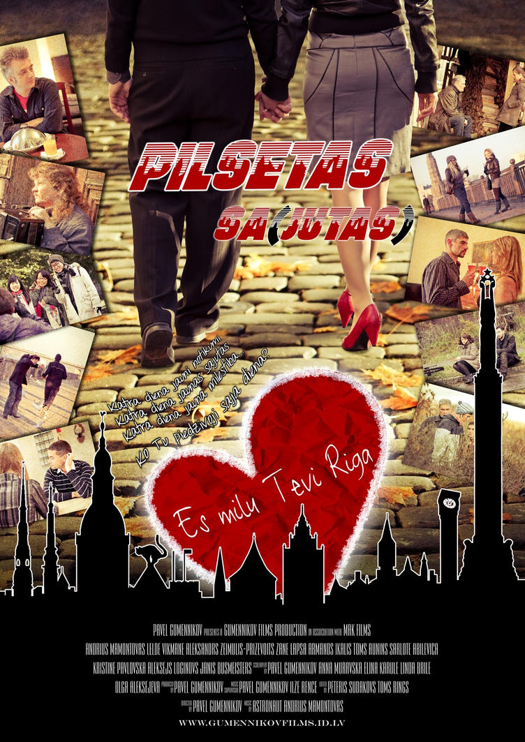
Personally I find it way too busy. I like the idea you were going for but I would probably cut out the extra pictures on the sides. Also, I'm not really fond of the stroke you have on the black city shape. Other then that it does have potential. I just find it too busy. Great work though.
#3
Mooey
-

- Members
-
- 587 posts
Retired P2L Staff
- Gender:Male
- Location:UK
-
Interests:http://500px.com/mikeholman
http://holmanmedia.net
Posted 10 November 2010 - 04:24 AM
Way too busy, I don't know what to look at first. Remove the thumbnails on the edges, make the city scape smaller, move down the film title and make it bigger maybe? Remove the heart in my opinion.
#4
Dezept1p
-
- Members
-
- 85 posts
Young Padawan
- Gender:Male
- Location:www.prohoney.com
- Interests:I like web-design, Rap and break dance<br />www.prohoney.com my web design studio.<br />Will be :)
Posted 10 November 2010 - 09:35 AM
THANKS A LOT! AppreciatedPersonally I find it way too busy. I like the idea you were going for but I would probably cut out the extra pictures on the sides. Also, I'm not really fond of the stroke you have on the black city shape. Other then that it does have potential. I just find it too busy. Great work though.

THANKS a lot mate!Way too busy, I don't know what to look at first. Remove the thumbnails on the edges, make the city scape smaller, move down the film title and make it bigger maybe? Remove the heart in my opinion.
#5
charlesj
-

- Members
-
- 8 posts
Young Padawan
- Location:Arlington, VA
- Interests:Skateboarding, UGA Football, Arsenal Football, music
Posted 19 November 2010 - 11:03 AM
As others have pointed out, it's way too busy with all of those photograps on the side. I do like the silhoutte cityscape though.


0 user(s) are reading this topic
0 members, 0 guests, 0 anonymous users

