With WordPress becoming one of the most preferred content management systems(CMSs), more and more website owners are choosing WordPress migration. Although WordPress websites are loaded with eye-catchy features, there are times when the site owner wants to incorporate an add-on that can refine the overall quality of the website.
A responsive drop down menu is one such perfect add-on that has been successful in adding a unique elegance to small/cursor-less web designs. If multi-level navigation is what you want for your WordPress website then designing a drop-down menu is perhaps the best option of meeting your requirement. Today, I present to you a handy tutorial on creation of a fully responsive Drop Down menu in WordPress.
You may also like the following articles:
Dropdown menus add usability to web designs
Prior to proceeding ahead with the steps involved with building a drop down menu in WordPress, let me make you familiar with one of the greatest advantages of equipping a website with responsive drop down menus. Well, with a responsive drop down menu, you can easily use different hyperlinks on parental anchors and open the same using a double-tap. The quick closure of drop down menus by simple tapping makes way for avoiding flashing and other usability errors up to a great extent.
What will be the approach for creating a custom drop-down menu in WordPress?
Talking about the approach that I would follow for creating a custom drop-down menu in WordPress, well, I'd be using the WordPress menu system for controlling the structure of the menu, followed by applying the custom styles to the respective WordPress theme. The drop-down menu thus created will be fully responsive and will work flawlessly on a variety of touch devices, irrespective of the web browser.
Demo of the drop-down menu we're going to create in this tutorial
Click Here to view the demo of the responsive drop-down menu that i'm going to create in this tutorial:
Prerequisites for Developing a Custom Drop-Down Menu in WordPress
- You'll need to have a basic understanding of CSS and PHP
- You'll need to be able to upload files to the WordPress theme's directory
- You'll need to be able to edit the theme's functions/php file
And now, the main steps:
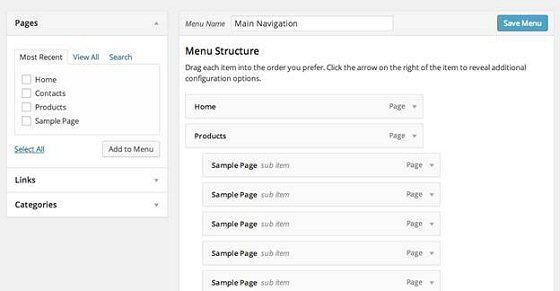
Step 1 - Create the Menu in WordPress
Here, you'll need to create the HTML structure for the menu using the WordPress menu system. For this, simply head over to Appearance tab-> Menu and create a new menu. Assign a suitable name to the menu and use the drag and drop feature to add items into the HTML structure. Once you're done with this, save the menu.
Step 2 - Create a Custom Walker Class
Prior to adding jQuery and CSS to the custom menu, it is important to ensure that the HTML being outputted for the new menu is free from any king of bugs/errors. For this, you'll need tocreate a custom WordPress Walker Class that ensures the menu items have been assigned the correct CSS classes. Initially implemented in WordPress 2.1, the Walker class provided developers a perfect means of traversing the tree-like data structures for rendering HTML. Now, for using the Walker class, you'll just need to copy and paste the same to the bottom of the WordPress theme's functions.php file.
Here's the Walker Class code that I'm talking about:
class CSS_Menu_Walker extends Walker
{
    var $db_fields = array('parent' =>; 'menu_item_parent', 'id' => 'db_id' );
    function start_lvl(&$output, $depth = 0, $args = array() )
    {
        $indent = str_repeat("\t",$depth);
        $output .= "\n$indent<ul>\n";
    }

    function end_lvl(&$output, $depth = 0, $args = array() )
    {
        $indent = str_repeat("\t",$depth);
        $output .="$indent</ul>\n";
    }

    function start_el(&$output, $item, $depth = 0, $args = array(), $id= 0 )
    {
        global $wp_query;
        $indent = ( $depth ) ? str_repeat("\t", $depth ) : '';
        $class_names = $value= '';
        $classes = empty($item->classes ) ? array() : (array)$item->classes;

        /* Add active class */
        if(in_array('current-menu-item', $classes))
        {
            $classes[] = 'active';
            unset($classes['current-menu-item']);
        }

        /* Check for children */
        $children = get_posts(array('post_type' => 'nav_menu_item','nopaging' => true, 'numberposts'=> 1, 'meta_key' =>'_menu_item_menu_item_parent','meta_value' => $item->ID));
        if (!empty($children))
        {
            $classes[] = 'has-sub';
        }
        $class_names = join( ' ', apply_filters( 'nav_menu_css_class', array_filter($classes ), $item, $args ) );
        $class_names = $class_names ?' class="' . esc_attr( $class_names) . '"' : '';

        $id = apply_filters( 'nav_menu_item_id', 'menu-item-'. $item->ID, $item, $args );
        $id = $id ? ' id="' . esc_attr( $id ) . '"' : '';

        $output .= $indent .'<li' . $id . $value . $class_names .'>';

        $attributes= ! empty( $item->attr_title ) ? ' title="'. esc_attr( $item->attr_title ) .'"': '';
        $attributes .= ! empty( $item->target )? ' target="'. esc_attr($item->target) .'"' : '';
        $attributes .= ! empty( $item->xfn )? ' rel="'. esc_attr( $item->xfn) .'"' : '';
        $attributes .= ! empty( $item->url )? ' href="'. esc_attr($item->url) .'"' : '';

        $item_output = $args->before;
        $item_output .= '<a'. $attributes .'><span>';
        $item_output .= $args->link_before. apply_filters( 'the_title', $item->title,$item->ID ) . $args->link_after;
        $item_output .= '</span></a>';
        $item_output .= $args->after;

        $output .= apply_filters( 'walker_nav_menu_start_el',$item_output, $item, $depth, $args);
    }

    function end_el( &$output,$item, $depth = 0, $args = array() )
    {
        $output .="</li>\n";
    }
}
Step 3 - Print the Created Menu
Here, I'll be using the wp_nav_menu() function for printing the menu. You can choose a suitable location where you want the menu to beprinted out. Once you've decided about this location, simply copy and paste thebelow code snippet there. In my example, I'm printing the menu in the header.php file. Here's the code snippet that I amreferring to:
<?php
wp_nav_menu(array(
'menu' => 'MainNavigation',
'container_id' => 'cssmenu',
'walker' => new CSS_Menu_Walker()
));
?>
Once you're done with placing the above code inthe theme's template file, save this file and refresh your site in the preferred browser.
Step 4 - Add the CSS
Now, add the CSS styles to the menu. You caneasily find all the CSS files in CSS/styles folder or the root directory of the WordPress theme. Here, it is important to note that we'll be using CSS ID that has already been specified in the wp_nav_menu() function. With all the basic menu styles in place, you need to create the CSS styles that'll operate the drop-down menu in different kinds of mobile devices.Here, you can use the Media queries for specifying the styles that suit thevarying screen widths.
Step 5 - Adding minimal jQuery
Next, you need to add a bit of jQuery to thetheme's script files. Just find the script.js or functions.js file and pastethe below mentioned code inside it:
$( document).ready(function() {
$('#cssmenu').prepend('<divid="menu-button">Menu</div>');
$('#cssmenu#menu-button').on('click', function(){
var menu = $(this).next('ul');
if (menu.hasClass('open')){
menu.removeClass('open');
} else {
menu.addClass('open');
}
});
});
Step 6 - Test out the Proper Functioning of Drop-Down Menu
Once you're done with adding the jQuery to the script files, save all the files and go back to the browser for testing the drop-down menu's operation in different web browsers.
Online Demo
Final Words
Building a custom drop-down menu in WordPress isactually a simple task if you follow all the aforementioned steps in a well-oriented manner. So, get going and abide by everything that's written in this tutorial to equip your WordPress portal with a mobile responsive drop-down menu.