


This tutorial looks at Fireworks CS3 and how you can create simple yet effective buttons. The buttons that I will be drawing here are simply for technique and I will not be putting them in to a template but may do in a future. So lets begin because Im going to be making varied buttons I am going to start by creating a canvas of 100 x 100.
Now lets start by creating the basic clean and glossy button. Mine will be blue. So lets start with the graphics. Draw your button or preffered shape ( I do not recommend starting with rounder corners or circles I'll get to that later on in another tutorial) heres mine.  This is just the shape so now lets make it look good. Make it a gradient. The gradient should relate to the colours you want on your website and/or the style on your website and dont forget that gradients going in different directions make a website nasty unless done in a way that makes it part of the website. My gradient was a darker blue to a lighter blue dark - #003399 light - #0066FF Now you should decide whether you want a flat or a button that seems to come up out of the screen. light at the top gives a more 3D look. Light at the bottom gives a more flat look and I feel is more generally slick but again depends on the website, your skill and the user perseption so it is important and remember. Look after the little details and the big ones look after them selves. There are other ways to do this but im not covering it in this tutorial 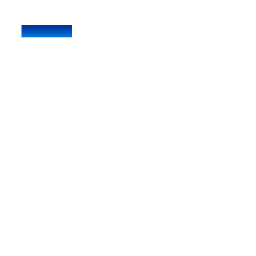 The next part again is a small detail but relates to the the style of the button and website in general.The outter stroke or outline and inline change how it looks and you can easily see the difference. web 2.0 would generally mean a darker than the main colour. This is done to really bring out the button and give a clean look but can still be taken in moderation by using a lighter but still darker colour or not at all and using other elements on your website to maintain the style if the button does not fit with it. I put on a lighter outline to bring the button out colour - #0033CC This gives clear definition on the button and really shows it up but again, this colour is up to you and must fit the site. Having bad colour matches on your site means your site is not as good as it can be and as much as some times it gets so boaring to lookup a colour that does not clash, It will make your site look a million times better if the colours go together.  so now lets make it glossy. copy and past te original shape, take of the outline and change both colours to white on the gradient then with the two little black arrows above the colour arrows which changes opacity (see through and what not) 100 being opaque and 0 being invisable. change the right hand side to 24 or something that suits you. (*COUGH* AND THE WEBSITE) Now change the shape so it fits the square to half it so it actually looks like gloss already and change the opacity to around 40. It should look like this 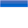 Now heres a trick of the trade. do you want gloss to overlap the outline or not? if not you can do one of two things. Re-size the gloss to fit or take the outline of the original square copy and past the original on top of gloss make it hollow (no colour in the middle) and add the outline to the one on top. So after that you should have threeparts to the layer. The original square with not outline then gloss then the square on top of both with just the outline. you should now have this. 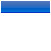 Go on to the next stage to see what effects you can add. Ok so now you have the button in its basic form. lets experiment. im going to add an in inline. The inline is a current fad which does seem to make the button look so much better. heres how mine looks. 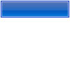 I did this buy copying the original square, making the center hollow and changing the outline to white and changing the opacity to 60 and changing the size so its 1 Px inwards on all sides. Now we have a nice clean button. NOW LETS ADD SOME DEPTH ;D USE THE FILTERS FOR THE BELOW FUNCTIONS use the inner shadow and and revolve it so that the shadow is on the bottom and the bottom only. change the opacity30%. now it looks like this.  Not much of a change but still adds something to the button and remember, look after the small deatils and the big ones look after them selves. now try adding an inner glow changing the setting to 2 and try experimenting with colours. making a light blue inner glow for me might make a nice rollover effect, using a white makes a lighter all round button for again possibly a rollover or just button. Black makes for a darker website. Here are my outcomes, the button at the bottom is done by an inner shadow set to white and made to go at the bottom. 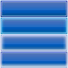 Thanks for reading my first ever tutorial. Hope to do more. 
Dig this tutorial?
Thank the author by sending him a few P2L credits!

GTS
My website is used for the webiste. I dable in everything I can and prefer fireworks to photoshop. Im in collage and the tuts I do should be simple stuff to be honest. Hope you enjoy my tutorials and please excuse errors or spelling mistakes. 


|