

Simple timeline graph with Prefuse Flare
I just finished the Flare shockwave that will replace stuff I previously made with jFlot. As you might know, I had to replace the processingjs linkmap with the Flare original due to performance issues with processingjs specifically and canvas + JS in general.
I had already implemented some simple time series graphs with jFlot but it just didn’t make sense having separate solutions, especially after looking at Flare more in depth and realizing that it just kicks ass. Yeah so be it, if using a proprietary solution will get the results I’m looking for then I’ll use it.
The following is a combination of the tutorial code and the timeline demo, enjoy:
package {
    import flash.events.MouseEvent;
    import flare.animate.Transitioner;
    import flare.display.TextSprite;
    import flare.util.palette.ColorPalette;

    import flare.data.DataSet;
    import flare.data.DataSource;
    import flare.scale.ScaleType;
    import flare.vis.Visualization;
    import flare.vis.data.Data;
    import flare.vis.operator.encoder.ColorEncoder;
    import flare.vis.operator.encoder.ShapeEncoder;
    import flare.vis.operator.encoder.PropertyEncoder;
    import flare.vis.operator.layout.AxisLayout;

    import flash.display.Sprite;
    import flash.events.Event;
    import flash.geom.Rectangle;
    import flash.net.URLLoader;

    import flare.util.*;

    [SWF(width="800", height="300", backgroundColor="#ffffff", frameRate="30")]
    public class TimelineTrends extends Sprite{
        private var vis:Visualization;

        public function TimelineTrends(){ visualize(getTimeline()); }
Not much to add here, we import all the stuff we need and set the size of the clip to 800×300.
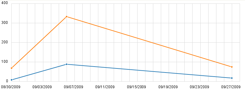
public static function getTimeline():Data{

        	var json:Array = [["09/01/2009", 9, 69],
						["09/10/2009", 66, 209],
						["09/12/2009", 23, 124],
						["09/30/2009", 18, 75]];

            json = json.map(function(element:*, index:int, arr:Array){
                element[0] = Dates.roundTime(new Date(element[0]), Dates.WEEKS);
                return element;
            });

            var summed:Array = new Array();
            for each (var item:Array in json){
            	var x = item[0].time;
            	if(summed[x] == null)
            		summed[x] = item;
            	else{
            		summed[x][1] += item[1];
            		summed[x][2] += item[2];
            	}
            }

            var data:Data = new Data();
            for (var j:uint = 1; j < 3; ++j) {
                for each (var item:Array in summed)
                    data.addNode({series: int(j-1), date: item[0], count:int(item[j])});
            }

            data.createEdges("data.date", "data.series");

            return data;
        }
    }
This is a special section. We will get data that has a daily resolution but then we convert it to have weekly resolution instead (I currently believe that it will result in a cleaner and more meaningful graph in the final implementation).
Pay attention specifically to the json.map call there, we use a callback to round the timestamps to the current week. After that we loop through each item and sum all items which are in the same week. Finally we use the summed data to actually create the nodes and edges.
Note that the array called json above will be imported as a json string of course, in the final implementation.
What’s left for next time is adding legends, setting the colors of the graphs explicitly and maybe some interactivity.
Finally we use the above to actually create the visualization:
private function visualize(data:Data):void{
            vis = new Visualization(data);
            vis.bounds = new Rectangle(0, 0, 730, 250);
            vis.x = 40;
            vis.y = 10;
            addChild(vis);

            vis.operators.add(new AxisLayout("data.date", "data.count"));
            vis.operators.add(new ColorEncoder("data.series", Data.EDGES, "lineColor", ScaleType.CATEGORIES));
            vis.operators.add(new ColorEncoder("data.series", Data.NODES, "fillColor", ScaleType.CATEGORIES));
            vis.operators.add(new PropertyEncoder({lineWidth:2}, Data.EDGES));

            vis.data.nodes.setProperties({fillColor:0, lineColor: 0xffffffff, lineWidth:1, size:0.5});
            vis.update();
}
The main visualize function, we position the graph area and set the axis layout, followed by colors and sizes of lines and nodes.
Related Posts
Tags: AS3, flare, flash, prefuse, visualization