


Faux Columns in CSS
There are a number of techniques to achieve this effect, including a javascript workaround, but for the purposes of keeping it clean and simple, we'll concentrate on the CSS version.
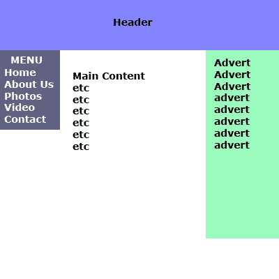
The ProblemYou have two or more columns. Lets say you have a menu on the left, adverts on the right and content in the middle. Heres an illustration of our proposed website, complete with the CSS and HTML.
The HTML and CSS
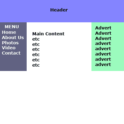
Now, a div will only expand vertically as far as its content. That menu bar on the left and the advert bar on the right - you want both to follow the page to the bottom, regardless of content.
The AnswerProduce a background image which takes into account the colours of problematic columns. You've designed the look of your site in Photoshop, or the graphics design program of your choice. It looks like the above illustration. Take a slice of this across its width, preferably no more than 5 px in height, like so:
What we're going to do is add a "wrapper" to the HTML. This nests all the column divs within this wrapper. Here's the new code: The HTML and CSS
So, what have we done? We've nested the left,middle and right column tags inside the new #wrapper tag. This wrapper tag then proceeds to repeat the background image (faux_background.png) in the vertical, or y direction. The result is, all columns are the equal of the height of the column with the most content.

Dig this tutorial?
Thank the author by sending him a few P2L credits!


|