Making A Twitter Logo Using ADOBE Illustrator (Beginners)
Many people would like to make their own logo..
well here i will teach you how to make your own logo..
In case that you don’t know how to use Adobe Illustrator, here is a very basic tutorial on how to use Adobe Illustrator.
Lets start with a “TWITTER LOGO”

Making the twitter logo is one of the most basic thing to do..
First Step Creating A Worksheet:
Run Your Adobe Illustrator and on the menu bar to File and click “New…”

And then change the Width and Height to 300 px. (you could your own dimensions of your worksheet)

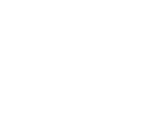
Second Step Making The Body (Box) :
Select the “Rectangle Tool” at the tools window
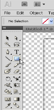
Then click and drag until you forms a square

then Fill the box with any color for now

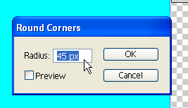
And then go to “Effects” at the menu bar (you have to select the square first)
go to Stylize >> Round Corners…
Change the Radius value to “45 px”.
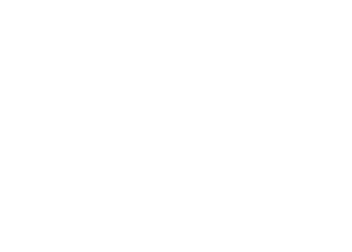
and the duplicate the square by selecting it and the pressing Ctrl+C and then Ctrl+V
Resize the duplicated square and change its fill color then put it in the middle of the previous square
It should look like this :
Select the square that is in the middle and change the color of the Stroke
It is located at the top left side of the window below the menu bar.
The stroke fill is by the right side the one with the whit square in the middle

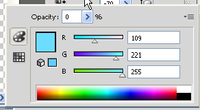
Hold Shift and click the Stoke Fill and change the color value to:
R: 164
G: 224
B: 249
Also change the color fill of the two squares (the left side of the stroke fill) to:
R: 100
G: 201
B: 232
It should look like this:

To make the chrome-like effect use the pen tool
then do something like this:
Select it and then go to Transparency and change its opacity to “7” %

now you have your Body:

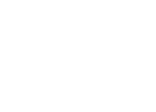
Third Step Making The “t”:
this should be the most easiest part if you have the font called “PICO Alphabet” just use the text tool and then type the letter “t”
but if you don’t have it like me.. then customize one on your own.
first use the pen tool and make an “L”
like this:
Select the “L” then go to Effects >> Stylize >> Round Corners
then change the Radius value to “37”


Then while the “L” is still selected change the Stroke Style to “7 pt. Round”
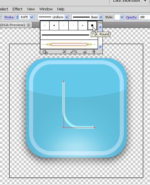
Then change the Stoke Weight to “0.075 in” as seen in the image:
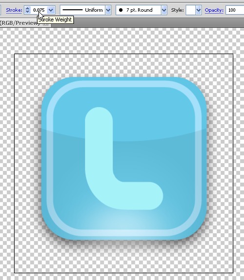
Then form the “t” by adding a line at the middle with the same width as the line “_” of the “L”.
Like this:
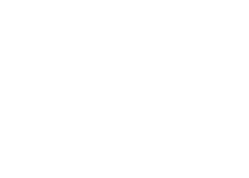
As for the White Stroke just copy the “t”, chinge the fill color to white and then resize it until it looks like this:
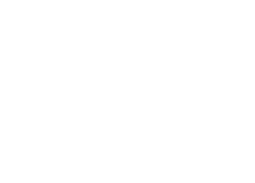
Change the blue “t” color to :
R = 166
G = 242
B = 249
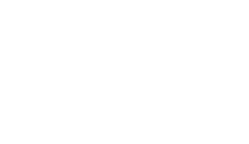
And then for the chrome effect again just like in the body but this time with a gradient effect..
first try to make it look like this:
For the gradient select the “Black” part and use the gradient tool
and change the color of the RIGHT end to:

and on the LEFT end :
then put the angle at “-70”
it should look like this:
And there you have it the “t” in the box:

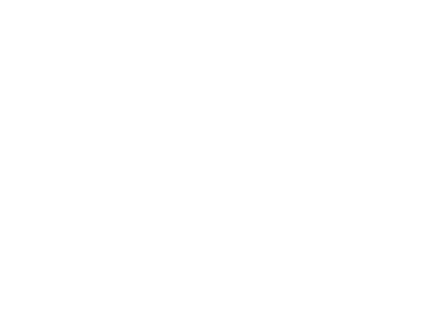
Final Step Adding Details :
This is simple just look at the images:
Just put some white lines at the edges of the “t” and use “Effects >> Blur >> Gaussian Blur…"
SAVING FILE AS PNG :
Go to File at the menu bar then click Save for Web & Mobile Devices…

then Here you Have IT!!:

Thanks For Reading My Basic Graphic Designing Tutorial
Please Visit: www.webnovation.com.au for Customized Logo Designs