


The folder icon is a pretty popular and useful graphic used in many types of digital designs. From your computer to your mobile devices, you can always see them, and they always convey that useful message of a place where the things you need are. Now, for custom designs either digitally or even for print such as postcard prints, poster prints or print calendars, you will want of course to have YOUR OWN folder icon or an icon of any other object for that matter. This tutorial will teach you just how to do that.
It is not that hard actually to create folder icons. Even novices in design should be able to handle it with the right instructions. In this guide, I will instruct you on how to do a folder icon step by step.Just sit back and follow through on these instructions and you will know what to do.
1. Open up Photoshop and create a new document. Just set the size that you need, but for our example, we are going for something big so that you can see easily. Set the resolution to 72 if you are going to use this icon in websites or as real icons. Set it to 300 if you plan on printing this on paper or other types of print surface.
 2. First, draw a simple rectangle. Choose the rectangle tool in your tool window.  3. Click and drag the tool to the appropriate size and ratio of a folder.  4. Next, select the rounded rectangle tool in the tools window. 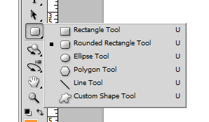 5. Now, draw a smaller rounded rectangle at the top left of the larger rectangle.  6. Next, press CTRL+T to transform our smaller rectangle.  7. Right click on the rectangle and choose perspective as the transform style.  8. Move the top right anchor of the rectangle inward to get the extruded part of our folder shaped.  9. If you think that the extruded rectangle is too large, right click on it and choose “scale” so that you can resize it in its trapezoid shape to a smaller size.  10. Once you have the right size and shape, press enter to commit our transformation.  11. Now, select both layers, and then right click on them. Select “Convert to Smart Object”. This should make both shape layers into one object we can manipulate.  12. With the new smart object selected, right click on it and then click on “blending options”.  13. Once the blending options window opens, tick on the “gradient overlay” option.  14. Click on the gradient box to customize the colour gradient. Choose something appropriate for your theme. For our example, we are going to use a dark orange to a light orange.  15. Tick the stroke option as well. Set the size to 1px and then the colour to a gray colour.  16. Now, we have the basic folder design.  17. The next step is to create the opening flay. First right click on our smart object and select “duplicate layer...” Just press OK on the window that opens.  18. Now, press CTRL+T on this new duplicate layer and then reduce the height of it just as you see below.  19. Next, right click on the shape and then press “Perspective”.  20. Then, select the top left anchor of the transform box and move it outwards. This gives the effect of an open folder.  21. Once you press enter, you should get your base for your folder.  22. Now, let us style the folder a bit. Add a white rectangle layer in the middle of our two folder layers to make it look like something is inside. 23. Just create a typical rectangle as usual and then slip it in between both those layers like so.  24. Modify the blending options of the white rectangle by adding the Stroke option 1px using grey colour....  25. Also add in a gradient overlay to make it look more dynamic. Press Ok once you’re done.  26. Finally, rotate the white paper rectangle a bit by pressing CTRL+T and then dragging your mouse in a circle along the edges of the shape.  27. Great! Now we have a good folder icon ready for publishing. 28. Add an additional style if you want by bringing up the blending options of the front flap layer, and then adjusting the General Blending Options opacity by about 70%.  29. Once done, you should have a good and sleek looking folder ready for most designs. Just alter the colours as necessary.  Visit this site, Printplace.com, to read more about Graphic Design Tutorials. 
Dig this tutorial?
Thank the author by sending him a few P2L credits!

kitkat
Kate Manhaven is a graphic artist who works with PrintPlace.com, an online printing company that offers business cards, postcard printing and poster printing services. She spends her free time either wakeboarding or snowboarding whenever the season permit 


|