This post was originally published in 2013
The tips and techniques explained may be outdated.
We’re probably all familiar with the classic techniques of photographic toning from seeing various examples of Sepia toned images, but for years analog photographers have been experimenting with chemical toners to create various processing effects. One such technique is to split tone a print to create a dark blue and copper coloured image with a dark dejected mood. In this tutorial we’ll look at using Photoshop to replicate this classic technique in digital form, using Color Balance adjustments to achieve the same range of blue and yellow tones.
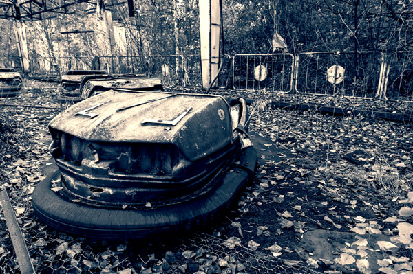
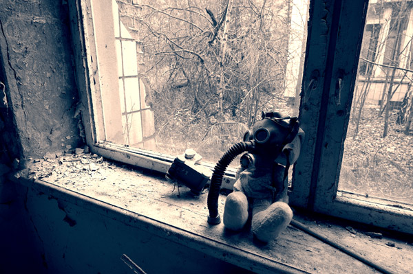
Typical sepia toning of a photograph gives the image that classic orange/brown appearance, resulting in a much warmer atmosphere than the basic black and white alternative. Split toning on the other hand produces much more stark effects by creating unusual colour combinations. One popular technique is the bleaching of highlights with sepia, followed by the treating of the shadows with selenium to give a harsh mix of blue and yellow tones. The result is a cold and dejected mood which works great with photographs of abandoned ruins or urban exploration. Here’s an example of this effect applied to a photo from a friend’s exploration of Chernobyl. See more of his great shots of Dark Pripyat.
Split toning in Photoshop
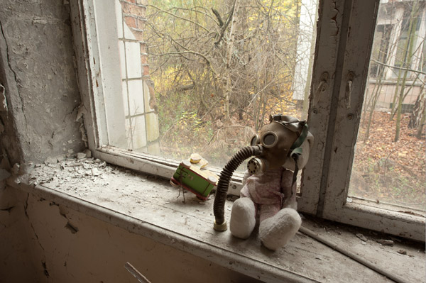
Sepia/Selenium split toning effects work best with photographs that feature some kind of desolate scene in order for the dark blues to give the image a gloomy atmosphere. My buddy Ric kindly supplied one of his Dark Pripyat shots as the base for this tutorial.
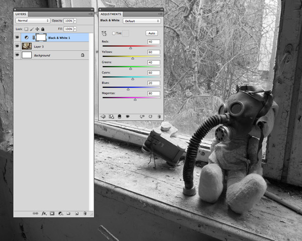
The whole purpose of photographic toning was to inject some colour into a basic black and white image before the colour film was available. Therefore the first step we need to take in Photoshop is to convert our modern digital image to monochrome. The best way to do this without losing the image’s contrast is to click the “New adjustment layer” icon at the bottom of the Layers palette and select Black & White.
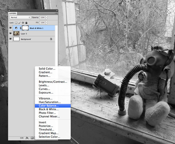
Add another Adjustment Layer, this time selecting Color Balance. There’s a few different ways to adjust the toning of your image, such as Gradient Maps or Curves adjustments on each channel, but the Color Balance option make it easy by allowing you to adjust the amounts of specified colours such as Yellow or Cyan.
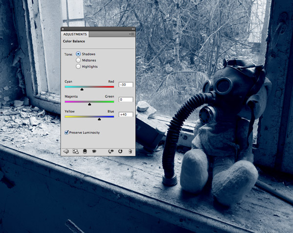
Make sure the Preserve Luminosity checkbox is selected, then change the Tone option to Shadows. Increase the Cyans and Blues in the shadows to create the Selenium effect by moving the sliders to 30 Cyan and 40 Blue.
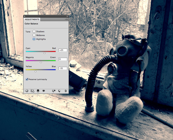
Next, change the Tone selection to Highlights, then adjust the sliders to represent the sepia tones in the highlights. This means moving the sliders to 25 Red and 35 Yellow.
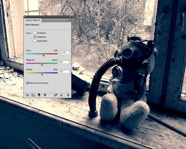
The image has already been given the dark split toning effect, but final adjustments of the overall tone can be made using the Midtones sliders. Adding just an extra +10 Red helps warm up the sepia tones a little, or conversely adding more blue will enhance the coldness of the effect.
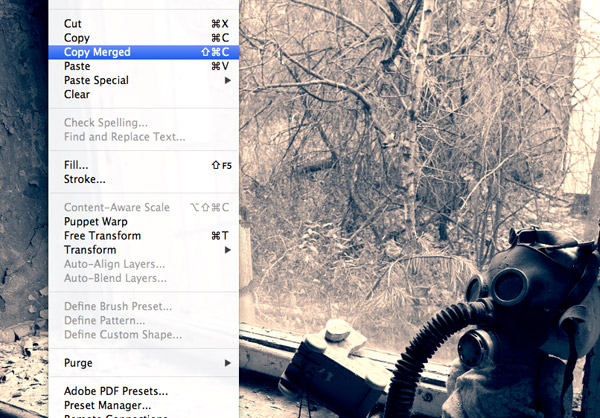
The split toning effect is complete, but I always like to sharpen up images with a quick High Pass filter. Press CMD+A to Select All, then go to Edit > Copy Merged. Paste a copy of the image at the top of the layer stack.
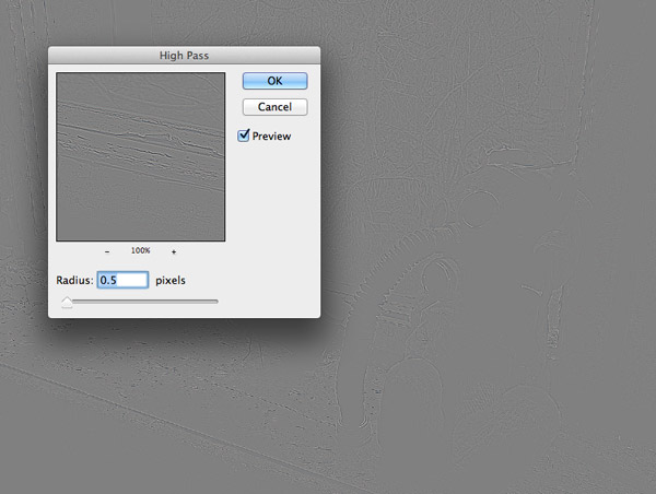
Go to Filter > Other > High Pass then adjust the slider until the details are subtly appearing from the grey background.
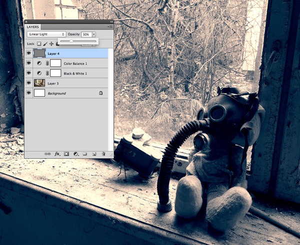
Change the blending mode of the high pass layer to Linear Light then reduce the opacity to around 30% to tone down the sharpening effect until it looks more natural.
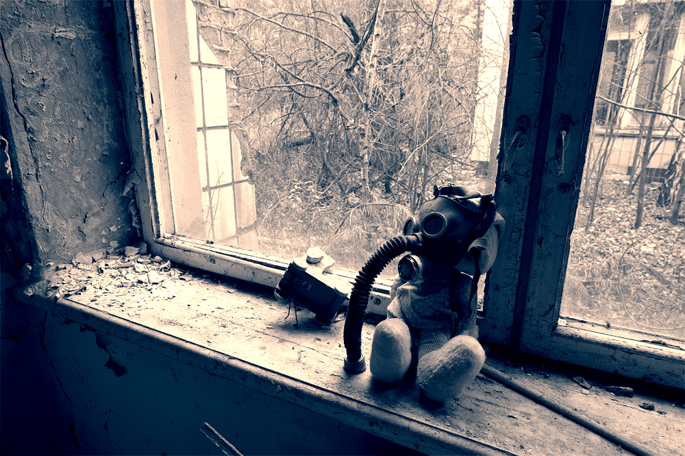
The final sepia/selenium split toning effect replaces all the tones of the image with blues and yellows and creates a dark and gloomy mood which enhances this particular subject of an abandoned city.
Here is my try Tokyo Disneyland Haunted Mansion Attraction.
http://img.photobucket.com/albums/v645/duceduc/scenic/tokyo-disneyland-haunted-mansion_zps03b52892.jpg
awesome tutorial! thanks for sharing this one.
Thanks Chris for this tutorial. Very nice photo.
Very cool…def trying this out later
Thanks Chris. I love the effect.
Awesome! Great lesson!!
Awesome effect, and so easy to do. I will be sure to save this as an action for future use. :)
Thanks
good tutorial budy
This is a great way to acheive the effect. I have been playing around with varous techniques for the last few months but this one looks like a winner.
Wow! Great tutorial, thanks. Photographic toning is very important in the art of photography.
Great effect!
We used to create this effect with duo tones but your method is probably more controllable.
Thanks :). Nice Work :).
Very Nice..
I am iranian!
I dont speek good english!
من یه ایرانیم!
خوب نمیتونم انگلیسی صحبت کنم!!!
منم یه گرافیستم اما تو کشور خودم، ایران.
I am a graphist
I normally achieve this effect using Lightroom, but thanks for keeping my PS skills on par!
I am now a days looking for such kind of filters and effects for my upcoming photography studio company! and this will surely help me! Thank you
Very useful tutorial… thanks for sharing it!!
Hi, I am new in graphics design. I know Picasa and photoscape perfectly. I use them to edit a photo or to give effects on photos. But I want to know the proper graphics design. I want to learn editing with photoshop, illustrator and other good tools. How can I learn from online?
Thanks in advance.
Regards
Paul