


http://www.sqthreer.com
I'm finally going to get my website up and running so I can have a place to host my tutorials and portfolio.
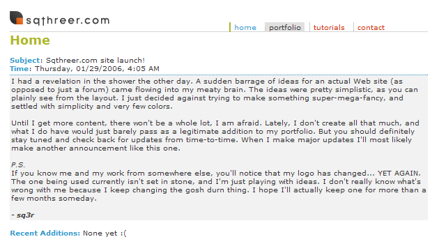
As the news item describes, I was purposely going for a VERY simplistic look, but I also wanted to maintain style. I think the colors I used match quite well. I also got myself a new logo that you can see in the title image.

www.sqthreer.com
Started by
sq3r
, Jan 29 2006 05:07 PM
-
 This topic is locked
16 replies to this topic
#1

sq3r
-
- Members
-

- 239 posts
Young Padawan
- Location:Oregon City, Oregon
- Interests:I like stuff.
Posted 29 January 2006 - 05:07 PM
#2
Nike
-

- Members
-
- 204 posts
Young Padawan
- Location:Ohio
- Interests:Controlling the human and and duck race.
Posted 29 January 2006 - 10:27 PM
Pretty good. I like the colors. Not a huge fan of the logo though.
#3
Sygon
-

- Members
-
- 18 posts
Young Padawan
Posted 30 January 2006 - 12:15 AM
I like how simple it is, its great imo
- sygon
- sygon
#4
greg
-

- Members
-
- 499 posts
Jedi In Training
- Location:New York City
- Interests:Fine art, web and graphic design, naval architecture, chess, and sports.
Posted 30 January 2006 - 12:59 AM
It looks like a great design, but it could use a touch-up and become even better:
- Increase the text size of the menu links. It's a good idea to have them be bigger than the content text size, just so they stand out more and add weight to the top of the page.
- Align the bottom of the menu links and logo. Right now, the menu links are too low and the logo is too high (and thus looks like it's floating).
- Just increase the overall text size by 1 or 2 pixels. It's far too small. I know some people think that smaller text looks "cooler," but it doesn't. All it does is make it hard for some people to read (those with high resolutions like myself, and those with poor eye vision).
- Add some more padding/margin to the paragraphs, so they're not so close to the edges of the div.
- I'd get rid of the gray background on hovered menu links. You've got nice colors there, gray just ruins it all. Also, I just don't think it looks good.
#5
Dh.
-

- Members
-
- 807 posts
CSS Guru
- Gender:Male
- Location:Berkshire, England
Posted 30 January 2006 - 04:54 AM
Lovely design mate, nice job
#6
sq3r
-
- Members
-
- 239 posts
Young Padawan
- Location:Oregon City, Oregon
- Interests:I like stuff.
Posted 30 January 2006 - 09:12 PM
It looks like a great design, but it could use a touch-up and become even better:
I wholely agree :)
- Increase the text size of the menu links. It's a good idea to have them be bigger than the content text size, just so they stand out more and add weight to the top of the page.
That makes a lot of sense. I will try that but I don't know about making them too much better.
- Align the bottom of the menu links and logo. Right now, the menu links are too low and the logo is too high (and thus looks like it's floating).
There has been something bothering me about the banner, and I do plan on fixing it by some means. I'll try doing that too.
- Just increase the overall text size by 1 or 2 pixels. It's far too small. I know some people think that smaller text looks "cooler," but it doesn't. All it does is make it hard for some people to read (those with high resolutions like myself, and those with poor eye vision).
HEY! Smaller text is cooler, man! Don't be raggin' on small text.
But seriously, I actually did think about the text size. Even for me on my 1024x768 resolution it's a bit hard to see without squinting. I will look into that.
- Add some more padding/margin to the paragraphs, so they're not so close to the edges of the div.
Yeah I actually already did that, but I just haven't uploaded it yet. I added about 3 more pixels to the padding and it looks a lot better.
- I'd get rid of the gray background on hovered menu links. You've got nice colors there, gray just ruins it all. Also, I just don't think it looks good.
Once again you've brought something up that was already on my mind :P
Such a large amount of gray (in comparison to other elements) really doesn't fit in with the rest of the scheme. I may limit the use of gray to smaller elements like horizontal rules and text and whatnot. What about making the "hover" of the nav turn the gray line to the side the same color as the "active" one, and instead of gray it will be a faint green background? I'll put all these ideas into the actual layout and update this thread later with the new look.
But thank you very much for the feedback; it's great to get positively critiqued instead of just "nice work" (those are nice too, though ;D.)
I encourage people to tell me what they don't like about it as well as what they do because, in all honesty, I'm not making this website just for myself to look at.
#7
DanWilliamson
-

- Members
-
- 651 posts
P2L Jedi
Posted 30 January 2006 - 11:14 PM
Hey,
I think it's great as I love simplicity in a design the fact that it's so simple makes it the best.
Try and have a bit more content though as it seems a bit 'empy' at the moment. Then perhaps as was suggest add a little bit bigger font on the links so they stand out a helluva lot more even 2px will make a different and maybe make it bold.
The grey background on the hover on the links ruins it all it looks horrible so I suggest getting rid of that.
All in all it's a beautiful site and I hope to see more content and the rest of your pages up soon
- Dan
#8
coolaid
-

- Members
-
- 1,435 posts
P2L Jedi Master
- Gender:Male
- Interests:i wonder..
Posted 31 January 2006 - 12:04 AM
it looks great  but you should code correctly so it shows right in IE also.
but you should code correctly so it shows right in IE also.
#9
sq3r
-
- Members
-
- 239 posts
Young Padawan
- Location:Oregon City, Oregon
- Interests:I like stuff.
Posted 31 January 2006 - 12:24 AM
Hey,
I think it's great as I love simplicity in a design the fact that it's so simple makes it the best.
Try and have a bit more content though as it seems a bit 'empy' at the moment. Then perhaps as was suggest add a little bit bigger font on the links so they stand out a helluva lot more even 2px will make a different and maybe make it bold.
The grey background on the hover on the links ruins it all it looks horrible so I suggest getting rid of that.
All in all it's a beautiful site and I hope to see more content and the rest of your pages up soon
- Dan
Yeah the person earlier went over both those things, and I do plan on changing them. Thanks though.
it looks great
The problem must be with your IE cause I've tested it in the latest version of Opera, Firefox and Internet Explorer.
Perhaps you have a very old version of IE?
Edited by sq3r, 31 January 2006 - 12:26 AM.
#10
coolaid
-
- Members
-
- 1,435 posts
P2L Jedi Master
- Gender:Male
- Interests:i wonder..
Posted 31 January 2006 - 01:45 AM
IE 6 because 7 is still in beta.
heres a ss of how it looks

heres a ss of how it looks

#11
sq3r
-
- Members
-
- 239 posts
Young Padawan
- Location:Oregon City, Oregon
- Interests:I like stuff.
Posted 31 January 2006 - 02:30 AM
That is really odd because I'm using IE 6 as well and it looks exactly the same in all three of the browsers I used.
Anyway I did a few of the things that were suggested to me, as well as a couple others. I decided against making the navigation links any bigger than the rest of the text because they stand out just fine. I tried making them just one size bigger, but it just looked really bad.
Here's what I did:
- widened the entire page by 50 pixels (to make room for future navigation links)
- made the text size 11px instead of x-small
- put the navigation links' borders on the opposite side
- on the nav, removed the hover background change completely and instead made the vertical line change to green and the text to blue
- moved the entire nav to the edge of the gray line
- put some extra padding below the nav links
- changed the title image (what I have now isn't my final thing either, I'm having some trouble getting it just right [suggestions on this would be great])
- more distance between the page title and the title image area
- a little extra padding inside the updates div
Here's a screenshot of what it used to look like for comparison:
If anyone else is having coolaid's problem please let me know, cause it's very strange. It looks perfect on my IE 6 o_o
#12
greg
-
- Members
-
- 499 posts
Jedi In Training
- Location:New York City
- Interests:Fine art, web and graphic design, naval architecture, chess, and sports.
Posted 31 January 2006 - 07:56 AM
The top is looking much better. The content doesn't show because of a MySQL error.
#13
sq3r
-
- Members
-
- 239 posts
Young Padawan
- Location:Oregon City, Oregon
- Interests:I like stuff.
Posted 31 January 2006 - 08:24 AM
Yeah right now I'm working on converting everything to PHP but I'm new with it so it's taking some time.
#14
Clandestine
-

- Members
-
- 833 posts
* Forum Police *
- Gender:Male
- Location:Redondo Beach, CA
Posted 31 January 2006 - 03:43 PM
put some padding on the left and right side, maybe 10px or so, its kinda hard on the eyes when its close to the edge. look good, nice and simpel
-Devyn
-Devyn
#15
sq3r
-
- Members
-
- 239 posts
Young Padawan
- Location:Oregon City, Oregon
- Interests:I like stuff.
Posted 31 January 2006 - 03:50 PM
Oh that's actually not how it's supposed to look. The alignment to the left of the page is a result of some minute error somewhere in the code after some PHP implementation. I'll fix it soon.
#16
Jamie Huskisson
-

- Members
-
- 3,648 posts
Retired P2L Staff
- Gender:Male
- Location:Nottingham, UK
Posted 31 January 2006 - 04:47 PM
please add padding on the left and right
#17
sq3r
-
- Members
-
- 239 posts
Young Padawan
- Location:Oregon City, Oregon
- Interests:I like stuff.
Posted 31 January 2006 - 06:37 PM
I know it's because of the reason I said in the post before yours, I was experimenting with PHP.
But it should be fixed now. It's mostly converted to PHP as well. This will make it a lot easier. I'm lucky I've got a friend with PHP knowhow
But it should be fixed now. It's mostly converted to PHP as well. This will make it a lot easier. I'm lucky I've got a friend with PHP knowhow


0 user(s) are reading this topic
0 members, 0 guests, 0 anonymous users

