Jump to content


Photo
* * * * * 2 votes

Simply Spa Logo Competition - 100GBP/185US$


  • This topic is locked This topic is locked
196 replies to this topic

#21 xis

xis

    Young Padawan

  • Members
  • Pip
  • 191 posts
  • Gender:Male
  • Location:Los Angeles, Ca.

Posted 12 August 2006 - 04:42 PM

Dunno why but that reminds me of a default brush in Photoshop, something I have seen on many sites too.


I think I may know where you've seen those, Donna. Some of the icon sets you've posted in the free resource area have icons that look those. The glossy look etc.

#22 seraph!m

seraph!m

    Pixels 4 Life!

  • Members
  • Pip
  • 172 posts
  • Location:"In heavenly places..."

Posted 12 August 2006 - 04:44 PM

Dunno why but that reminds me of a default brush in Photoshop, something I have seen on many sites too.


I saw something like it in the AE Art competition...maybe that's where you saw it. (Clicky!)

EDIT: If you look at the grassy shape inside his logo and the grassy shape in the logo on the other side of that link, they are the same shape. The one on this forum is simply scaled down vertically. Looks kinda like copying to me... :/

Edited by seraph!m, 12 August 2006 - 04:55 PM.


#23 Griffin

Griffin

    P2L Staff

  • P2L Staff
  • PipPipPipPip
  • 1,207 posts
  • Gender:Male
  • Location:California
  • Interests:Things I find interesting.

Posted 12 August 2006 - 04:50 PM

I think I may know where you've seen those, Donna. Some of the icon sets you've posted in the free resource area have icons that look those. The glossy look etc.


I believe she was refering to the grassy object inside of it.

- Griffin

#24 The_pro_designer

The_pro_designer

    Jedi In Training

  • Members
  • PipPip
  • 316 posts
  • Gender:Male
  • Location:South Carolina, USA!
  • Interests:I am a Graphics designer, I work at Target, and I have a beautiful girlfriend names Mckenna. <3 Thats about it.

Posted 12 August 2006 - 04:55 PM

so do I. :) and as I said it is defult.. why make it when you get it free? Hehe. :D looks better then just the box..

#25 Donna

Donna

    Retired P2L Queen!

  • P2L Staff
  • PipPipPipPip
  • 12,330 posts
  • Gender:Female
  • Location:B.C Canada

Posted 12 August 2006 - 05:09 PM

so do I. ^_^ and as I said it is defult.. why make it when you get it free? Hehe. :) looks better then just the box..


You should submit something that's 100% your work not someone elses, surely you don't expect anyone to pay out on a competition when you used a readymade do you? I hope not.

#26 The_pro_designer

The_pro_designer

    Jedi In Training

  • Members
  • PipPip
  • 316 posts
  • Gender:Male
  • Location:South Carolina, USA!
  • Interests:I am a Graphics designer, I work at Target, and I have a beautiful girlfriend names Mckenna. <3 Thats about it.

Posted 12 August 2006 - 05:42 PM

The only thing that wasnt mine was that little grass thing.. But is you wan't me to remake it I can.. Woulden't take long..

and the only one who hasent used the shape tool is griffen so far.. J used the flower one ^_^
:/ pro

Edited by The_pro_designer, 12 August 2006 - 05:45 PM.


#27 seraph!m

seraph!m

    Pixels 4 Life!

  • Members
  • Pip
  • 172 posts
  • Location:"In heavenly places..."

Posted 12 August 2006 - 05:59 PM

*backing out of the competition...lol*

Edited by seraph!m, 16 August 2006 - 12:18 PM.


#28 The_pro_designer

The_pro_designer

    Jedi In Training

  • Members
  • PipPip
  • 316 posts
  • Gender:Male
  • Location:South Carolina, USA!
  • Interests:I am a Graphics designer, I work at Target, and I have a beautiful girlfriend names Mckenna. <3 Thats about it.

Posted 12 August 2006 - 07:07 PM

new one
Posted Image

#29 Griffin

Griffin

    P2L Staff

  • P2L Staff
  • PipPipPipPip
  • 1,207 posts
  • Gender:Male
  • Location:California
  • Interests:Things I find interesting.

Posted 12 August 2006 - 07:38 PM

Heres another, also added to original post:

Posted Image


- Griffin

Edited by Griffin, 12 August 2006 - 07:38 PM.


#30 The_pro_designer

The_pro_designer

    Jedi In Training

  • Members
  • PipPip
  • 316 posts
  • Gender:Male
  • Location:South Carolina, USA!
  • Interests:I am a Graphics designer, I work at Target, and I have a beautiful girlfriend names Mckenna. <3 Thats about it.

Posted 12 August 2006 - 08:02 PM

Thats really nice G!

#31 mattyK

mattyK

    Young Padawan

  • Members
  • Pip
  • 201 posts
  • Location:Surrey, BC, Canada
  • Interests:Graphic Design, Soccer, Hockey, Guitar, CKY

Posted 12 August 2006 - 10:34 PM

not crazy about the font, but that graphic is amazing

#32 Griffin

Griffin

    P2L Staff

  • P2L Staff
  • PipPipPipPip
  • 1,207 posts
  • Gender:Male
  • Location:California
  • Interests:Things I find interesting.

Posted 12 August 2006 - 10:47 PM

Thanks :P...never been great at choosing fonts, but ill see if I can find something a little more pleasing to the eye heh.

- Griffin

Edited by Griffin, 12 August 2006 - 11:13 PM.


#33 The_pro_designer

The_pro_designer

    Jedi In Training

  • Members
  • PipPip
  • 316 posts
  • Gender:Male
  • Location:South Carolina, USA!
  • Interests:I am a Graphics designer, I work at Target, and I have a beautiful girlfriend names Mckenna. <3 Thats about it.

Posted 12 August 2006 - 11:01 PM

I don't think anyone can say they never take atleast 4,000 hours to find a font that is even decent for what they vision or want. :/

#34 bstbwlraround

bstbwlraround

    Young Padawan

  • Members
  • Pip
  • 6 posts

Posted 12 August 2006 - 11:27 PM

heres a logo

Attached File  SimplySpa3_copy.png   81.36KB   179 downloads

#35 Griffin

Griffin

    P2L Staff

  • P2L Staff
  • PipPipPipPip
  • 1,207 posts
  • Gender:Male
  • Location:California
  • Interests:Things I find interesting.

Posted 13 August 2006 - 12:29 AM

Nice job bstbwlraround. Just a quick critique though...get rid of the rose thats cut off at the bottom, kind of makes it look like a sig or something.

- Griffin

#36 mattyK

mattyK

    Young Padawan

  • Members
  • Pip
  • 201 posts
  • Location:Surrey, BC, Canada
  • Interests:Graphic Design, Soccer, Hockey, Guitar, CKY

Posted 13 August 2006 - 12:35 AM

Here are all of my entries

Logo Portfolio

Edited by mattyK, 14 August 2006 - 05:37 PM.


#37 Discontinuity

Discontinuity

    Young Padawan

  • Members
  • Pip
  • 63 posts

Posted 13 August 2006 - 12:58 AM

Thanks for all the responses so far :D.


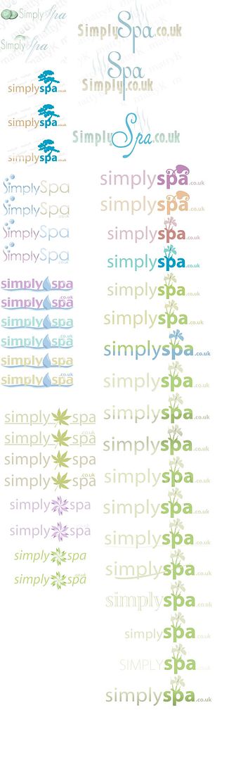
I won't go so far as to critique individual logos at this point, but here's a bit more feedback on what scores points.


1) good horizontal use - remember it'll have to go as the header of a website

2) you don't need to shout 'simply spa' to say 'simply spa'. http://r-industries.net/ae%20art.png while using a default brush was one of the logos that made me thing about opening this competition here.

3) 'natural' colours are good

4) cohesiveness and simplicity are good. an icon or iconic design generally makes the difference between straight up text and a 'logo', the more the two come across co-joined the better.

5) sans-serif or unfussy fonts get marks too :P


hope that helps - just want to say that i'm very happy to have so much of a response, so quickly.


John

#38 Griffin

Griffin

    P2L Staff

  • P2L Staff
  • PipPipPipPip
  • 1,207 posts
  • Gender:Male
  • Location:California
  • Interests:Things I find interesting.

Posted 13 August 2006 - 01:02 AM

Two updated logos, hopefully following the above stated guidelines...

Posted Image

#39 The_pro_designer

The_pro_designer

    Jedi In Training

  • Members
  • PipPip
  • 316 posts
  • Gender:Male
  • Location:South Carolina, USA!
  • Interests:I am a Graphics designer, I work at Target, and I have a beautiful girlfriend names Mckenna. <3 Thats about it.

Posted 13 August 2006 - 01:03 AM

Thanks for the tips.. Will do more off those sugegstions later today!

#40 mattyK

mattyK

    Young Padawan

  • Members
  • Pip
  • 201 posts
  • Location:Surrey, BC, Canada
  • Interests:Graphic Design, Soccer, Hockey, Guitar, CKY

Posted 13 August 2006 - 01:11 AM

Two updated logos, hopefully following the above stated guidelines...

Posted Image


Really like both, nicely done


0 user(s) are reading this topic

0 members, 0 guests, 0 anonymous users