


Logo Competition - Big(ish) Prizes!
Started by
Patterick
, Aug 31 2006 04:36 PM
-
 This topic is locked
51 replies to this topic
#21
 Prizes!: post #21")
InFeri
-

- Members
-

- 120 posts
Young Padawan
- Gender:Male
- Location:The Netherlands
- Interests:Graphics (ofcourse :P), listening to music, relaxing and playing drums with my band :)
Posted 01 September 2006 - 08:08 AM
Thanks
#22
Babyface
-

- Members
-
- 66 posts
Young Padawan
Posted 01 September 2006 - 08:15 AM
my first entries:


Edit: another one

hoping for some feedback
Edit: another one
hoping for some feedback
Edited by Babyface, 01 September 2006 - 08:32 AM.
#23
Patterick
-
- Members
-
- 15 posts
Young Padawan
Posted 01 September 2006 - 10:17 AM
Those are just awesome ;D
Good job on them.
Whats the last one though
I cant see anything =[
Good luck ^^
Good job on them.
Whats the last one though
I cant see anything =[
Good luck ^^
#24
Babyface
-
- Members
-
- 66 posts
Young Padawan
Posted 01 September 2006 - 10:23 AM
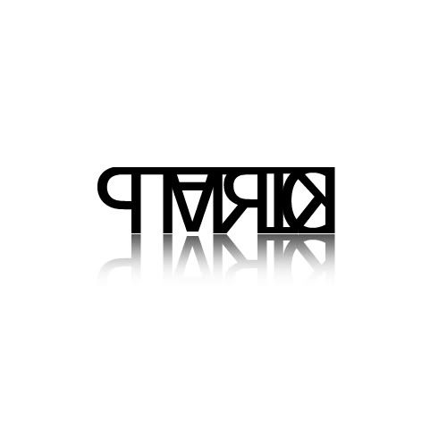
the last one may require some fantasy  the blue thing is the J and the first letter is a p and the second a k
basicly i made the P and the J out of one letter, and added half a K to the right...
the blue thing is the J and the first letter is a p and the second a kbasicly i made the P and the J out of one letter, and added half a K to the right...
#25
InFeri
-
- Members
-
- 120 posts
Young Padawan
- Gender:Male
- Location:The Netherlands
- Interests:Graphics (ofcourse :P), listening to music, relaxing and playing drums with my band :)
Posted 01 September 2006 - 10:31 AM
Ah.. now I see it lol...
#26
Patterick
-
- Members
-
- 15 posts
Young Padawan
Posted 01 September 2006 - 11:28 AM
Oh yeah thats clever
Hehe Good job
Hehe Good job
#27
Matheus
-

- Members
-
- 1,058 posts
P2L Jedi Master
- Gender:Not Telling
Posted 01 September 2006 - 03:12 PM
mine

#28
InFeri
-
- Members
-
- 120 posts
Young Padawan
- Gender:Male
- Location:The Netherlands
- Interests:Graphics (ofcourse :P), listening to music, relaxing and playing drums with my band :)
Posted 01 September 2006 - 04:27 PM

Edited mine a little bit
 For those who aren't able to see what it is, it spells PJK ^^ . This size is 40% from the original. I'd like some feedback please
 Good luck to the other contestants
#29
mattyK
-

- Members
-
- 201 posts
Young Padawan
- Location:Surrey, BC, Canada
- Interests:Graphic Design, Soccer, Hockey, Guitar, CKY
Posted 01 September 2006 - 04:42 PM
the little man on top is actually the letters pjk
#30
Babyface
-
- Members
-
- 66 posts
Young Padawan
Posted 01 September 2006 - 06:11 PM
great idea that! nice work mattyK
#31
Discontinuity
-

- Members
-
- 63 posts
Young Padawan
Posted 01 September 2006 - 06:19 PM
lovely work MattyK, inFeri.
but you know that
but you know that
#32
Ben
-

- Publishing Betazoids
-
- 1,366 posts
P2L Jedi Master
- Gender:Male
- Location:VIC, Australia
Posted 01 September 2006 - 06:29 PM
I see a lot of nice entries I hate having to think of idea's for logos
I hate having to think of idea's for logos
#33
Matheus
-
- Members
-
- 1,058 posts
P2L Jedi Master
- Gender:Not Telling
Posted 01 September 2006 - 08:17 PM
tomorrow I'll try to figure out some better and original ideas
#34
Patterick
-
- Members
-
- 15 posts
Young Padawan
Posted 02 September 2006 - 05:36 AM
Nice job all of you
Good luck, and times going so slow =[ ill probably have a million to check through in 10 days. But hey its worth it right?
Oh and i will pick FIVE people in this forum alone to get a free domain without hosting if they didnt come second or third, call it runner up prize
Good luck, and times going so slow =[ ill probably have a million to check through in 10 days. But hey its worth it right?
Oh and i will pick FIVE people in this forum alone to get a free domain without hosting if they didnt come second or third, call it runner up prize
#35
d2Squared
-

- Members
-
- 828 posts
P2L Jedi
- Gender:Male
- Location:Israel
- Interests:Swimmig<br />Web-design<br />Starcraft
Posted 02 September 2006 - 09:02 AM
Here are mine, I usually dont design Logos, I build them, anyway, here they are:


I'll Come up with more i guess, but they are just ideas
I'll Come up with more i guess, but they are just ideas
#36
Patterick
-
- Members
-
- 15 posts
Young Padawan
Posted 02 September 2006 - 10:26 AM
ooh nice
Good job, very creative
Good job, very creative
#37
Al3x
-

- Members
-
- 179 posts
Young Padawan
- Location:Bradford, UK
Posted 02 September 2006 - 03:24 PM
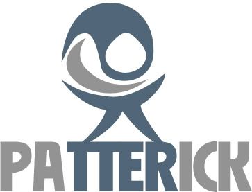
One of your entries says Pattrick instead of Patterick.
#38
saseke
-

- Members
-
- 76 posts
Young Padawan
- Interests:making website in html / css / php / photoshop / flash.
Posted 02 September 2006 - 04:26 PM
i can make a 3d logo for your site if u want that ^^ hope i will win i will get started
#39
Patterick
-
- Members
-
- 15 posts
Young Padawan
Posted 03 September 2006 - 05:25 AM
Good luck ^^
Keep the psd or the outline of it though incase you win.
Keep the psd or the outline of it though incase you win.
#40
Ben
-
- Publishing Betazoids
-
- 1,366 posts
P2L Jedi Master
- Gender:Male
- Location:VIC, Australia
Posted 03 September 2006 - 05:44 AM
Heres another one I made:


0 user(s) are reading this topic
0 members, 0 guests, 0 anonymous users

