figured id give you guys an idea of what i can do (which isnt much lol)
take a look and let me know what you think
1
2
3
4
5
6
7
this isnt all my work just a few of what i think are the better pieces lol.
anyway cnc is always welcome and appreciated.
my sigs
Started by
Tanios
, Mar 18 2009 08:49 AM
3 replies to this topic
#1
Posted 18 March 2009 - 08:49 AM
#2 _*jonbey_*
Posted 18 March 2009 - 08:02 PM
I think they are fantastic. I am not really an artist though, but they look great to me.
#3
Posted 18 March 2009 - 10:19 PM
thanks
i have always struggled with text but i have come along way with backgground compo and effects lol
altough i still think i need some more work.
thats part of why im here to try and get some other opinions on my work and hopefully improve my skills. i just need some people who know what im doing wrong and help me fix it.
really though ... thanks for the comments.
#4
Posted 10 April 2009 - 05:16 AM
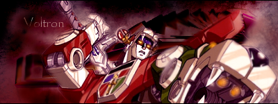
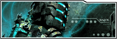
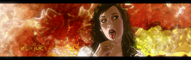
Text can be made to look really good. I used to struggle with it too, these are some tips I was given:
1. Never leave text PERFECTLY horizontal, it makes the text seem forced on. Position the text to match the glow of the sig. A little angle can go a long way.
2. Try to use more contemporary fonts, unless you're specifically going for something otherwise. Blocky, fat fonts generally aren't pleasing to the eye.
3. Size doesn't matter. HUGE text can distract the viewer from the Focal point of your work. Keep the text small and simple
4. NEVER, EVER (and I mean ever) use a Bevel and Emboss for text, unless its on 100% scale and 1px size. A Bevel and emboss that isn't subtle has caused blindness. True story.
5. Style subtlely. If you're going for some text, why not just give it a white colour, set it to overlay/soft light at 100%, and then just apply a dropshadow? (distance, 1, spread 1)? That's what I do. The drop shadow doesn't look tacky this way. It just looks like a stroke that works towards an angle, again helping the flow of the sig.
Finally, text should compliment you're work. There's a fine line between contrast and sheer distraction...
EDIT: That means a really small drop shadow with no tacky blur/smudged out effect.
Edited by Mariomoussa, 10 April 2009 - 05:17 AM.
0 user(s) are reading this topic
0 members, 0 guests, 0 anonymous users