

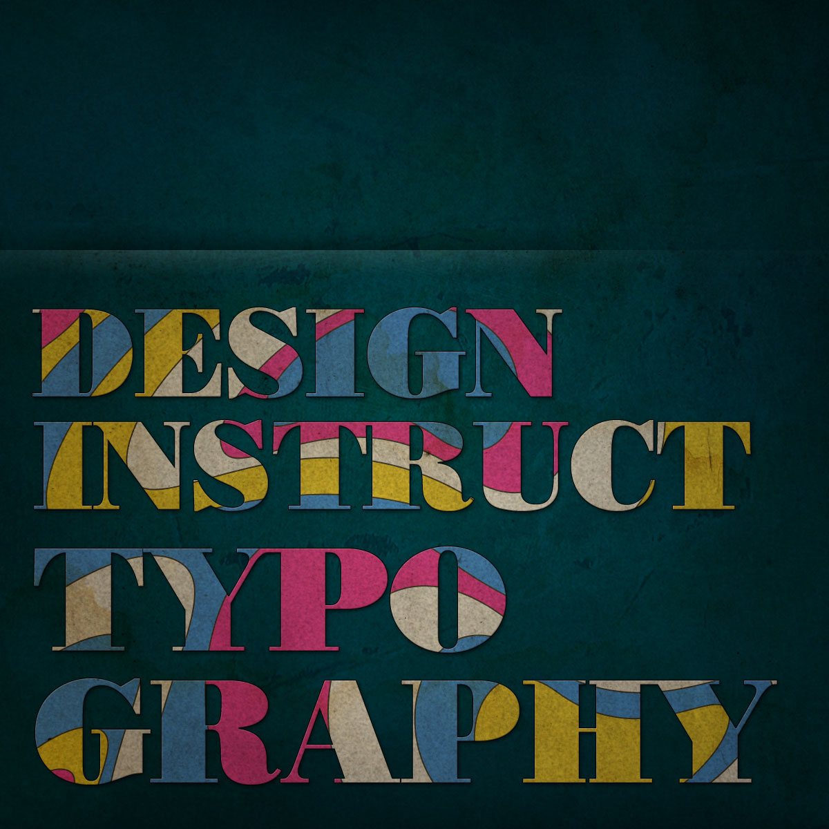
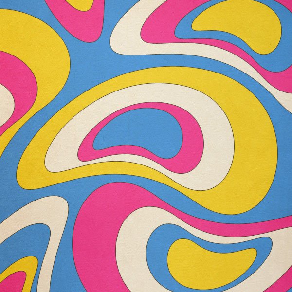
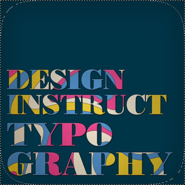
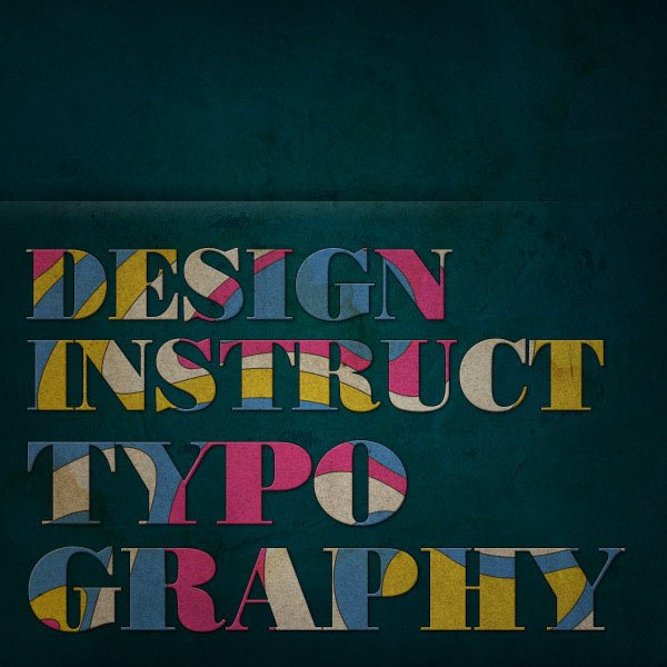
Preview
This is what we’ll be creating. You can click on the first image to see the full-scale version.
Resources
- Collage Texture by Zen Textures
- Stained Paper Texture by Zen Textures
- Paper Texture by Zen Textures
Step 1: Creating the shapes
We are going to start by creating a new 1200px x 1200px document in Adobe Photoshop.
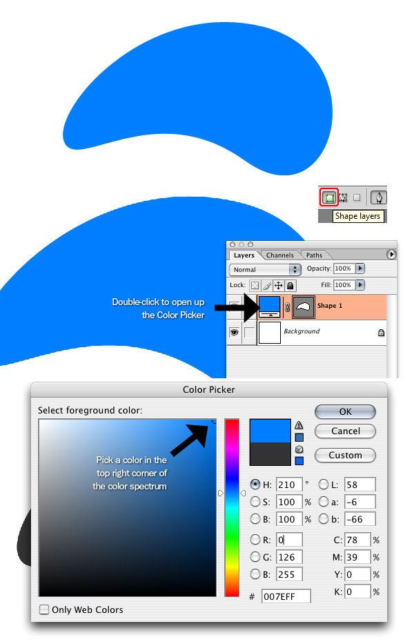
Using the Pen Tool (P), we are going to create an abstract organic shape, something like what I have below. Make sure that you make a Shape layer, and not Paths; you can change this setting via the Options bar.
Change the color (double-click the Color option box to open up color editor dialog box) to a blue color (#017eff). Keep in mind that, for now, we are going to use fully saturated colors, which are at the top right of the color spectrum.
Step 2: Adding more shapes
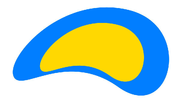
We are going to duplicate the shape layer we just made with Ctrl/Cmd + J.
Change the color to a bright yellow color (#ffd801).
Again, pick a color that is at the top right of the color spectrum.
Use Ctrl/Cmd + T (Free Transform) to transform the shape to make it smaller; hold down the Shift key to keep the shape in the same proportion as the original.
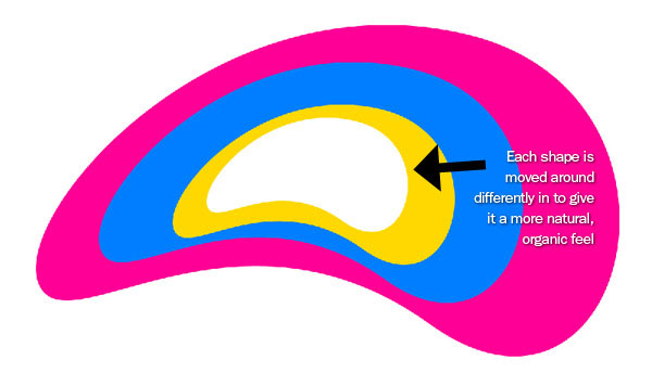
Step 3: Adding even more shapes
Repeat step 2 twice more. Change the first color to white (#ffffff) and a pink color for the second one (#fe0096) for the second one.
The shapes should be moved around inside one another a little bit to give it more of a natural, organic, floating feel; you can use the Move Tool (V) to move things around.
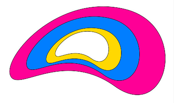
Step 4: Adding a stroke to the shapes
Before we go any further, we are going to add a stroke around each shape.
Click on the Add a layer style icon at the bottom of the Layers Panel. Then click on Stroke and adjust your settings so you have black (#000000) as your stroke color and 2px as your stroke size. Repeat this for all of the shapes.
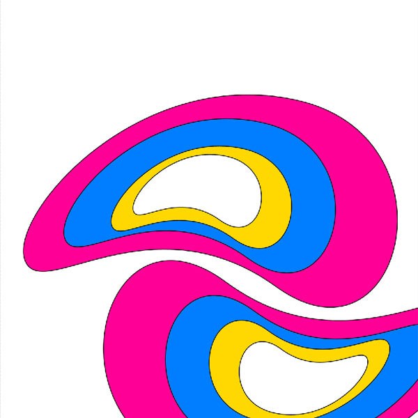
Step 5: Creating the text background
Move the layers we just created into a folder called Shape1.
Right-click on the folder and click Duplicate Layer Set. Call the new folder Shape2.
Click on the Shape2 shape folder and then Ctrl/Cmd + T for a Free Transform. Rotate Shape2 until you get something like what I have.
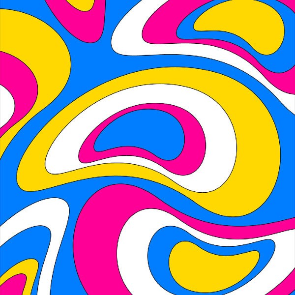
Step 6: Finishing the text background
Continue duplicating and rotating the shapes until you cover up most of the area of the canvas while keeping the white space in between the shapes.
You can also go into Edit > Transform > Flip Horizontally to get the shapes to fit better. The key is to get a flowing feel within the blue negative space as well as with the shapes themselves.
Alternate the same 4 colors in the different shapes so you have more of a random look.
Change the background layer to the blue (#017eff) you picked earlier, sothat you have something like the image below.
Step 7: Adding a retro look
We are going to give our background more of an old and retro look. To achieve this look, we are going to use this paper texture from Zen Textures.
Using Ctrl/Cmd + T (Free Transform), shrink the texture so it fits around the image. Make sure the texture is the top layer and lower the opacity to 40%. Now would be a good idea to save your Photoshop document, by the way.
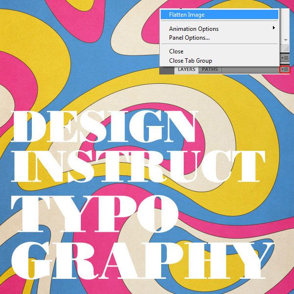
Step 8: Merging the layers and adding text
We are going to take all the layers and merge them into one layer. To do this, click on the downward-pointing arrow icon on the top right of the Layers Panel and click on Flatten Image in the menu that appears.
Our shapes should turn into the background image, which is locked. To unlock it, double click on the layer and then rename it to something like Wavy Backgound.
Now we are going to put in some white (#ffffff) text.
The font I am using is Bodoni Poster, but you can use whatever font you would like (a bolder font will work the best).
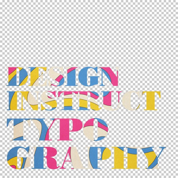
Step 9: Masking the text background
Drag the text layer down the Layers Panel so that it is under the wavy background layer.
Click on the Wavy Background layer and go to Layer > Create Clipping Mask (Ctrl/Cmd + G). This should mask out our background so that it shows up only where the text is. In your Layers Panel, the masked out image should have a downward arrow, and the text should be underlined.
The benefit of making letters this way is that you can change the text around any way you want and still have the masked image in the background.
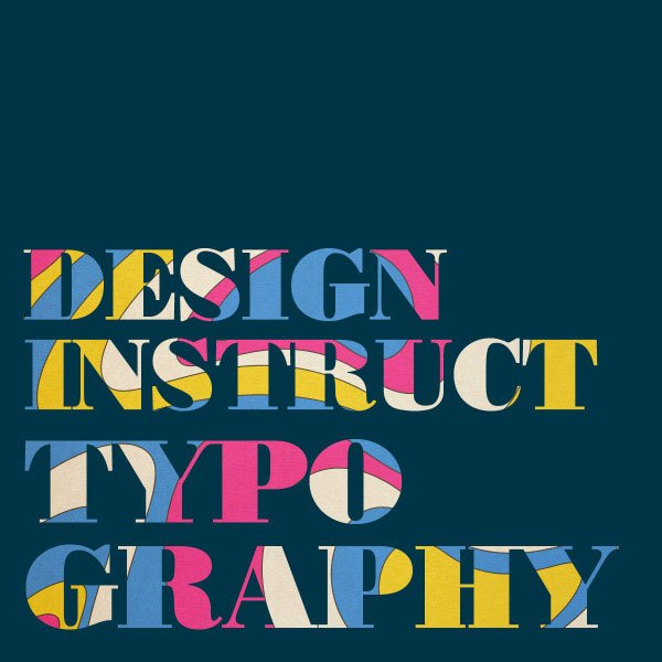
Step 10: Coloring the background
Create a new layer and move it all the way to the bottom.
Call it Background and fill it with a blue color like #003547.
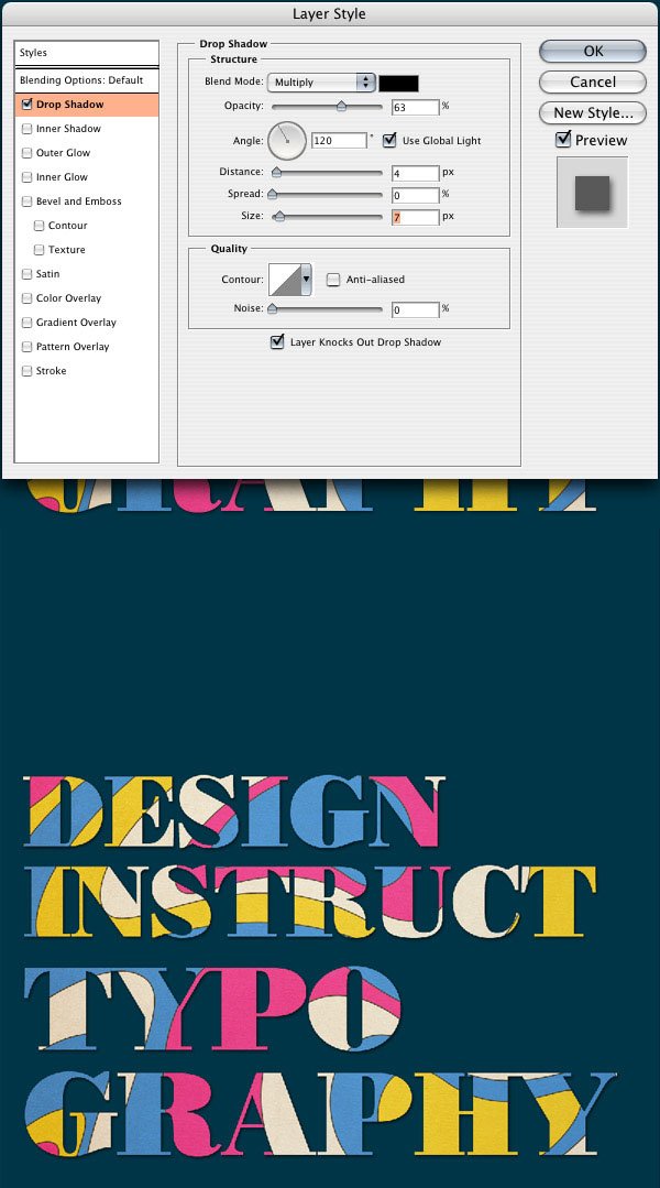
Step 11: Adding a Drop Shadow layer style
Let’s add some effects to the text. Click on the text layer, then click on the Add a layer style icon on the bottom of the Layers Panel and choose on Drop Shadow. Change your settings to what I have below.
This subtle background will give our text a little more depth so that it looks like it is sitting on the background.
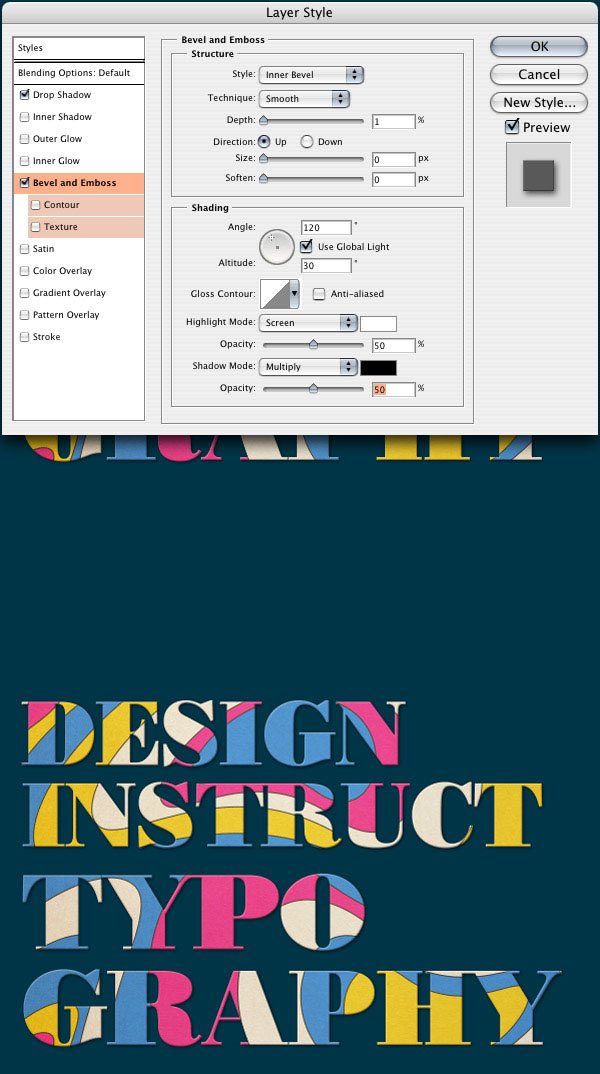
Step 12: Adding a Bevel and Emboss layer style
Now we are going to open up the Layer Styles dialog box again and apply a Bevel and Emboss layer style. This will give our text a little bit of an edge, giving it a subtle 3D look.
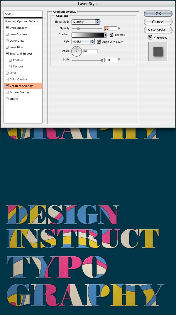
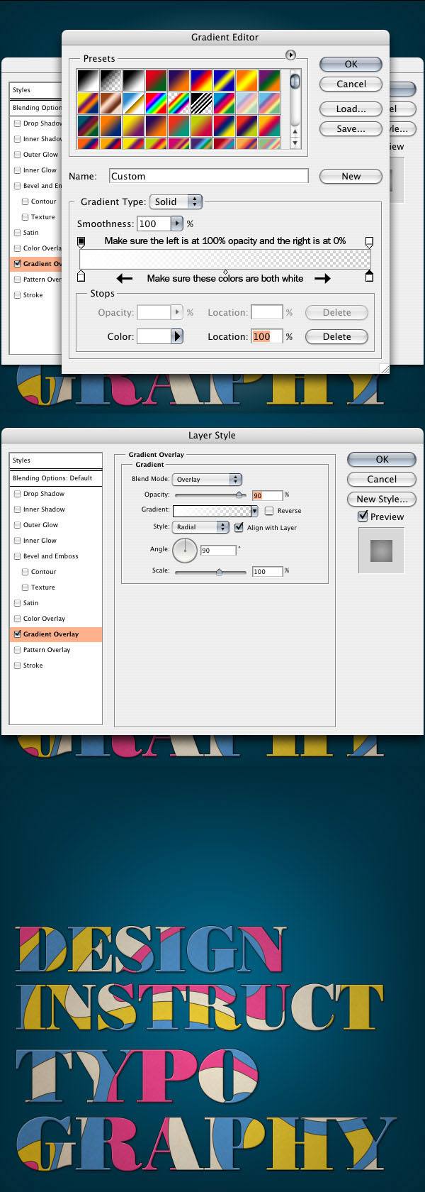
Step 13: Adding a Gradient Overlay layer style
Open up the Layer Styles dialog box again and apply a Gradient Overlay layer style. We are using a white to black gradient.
This will vary the lightness and darkness of the text and give it a little more realistic look to it.
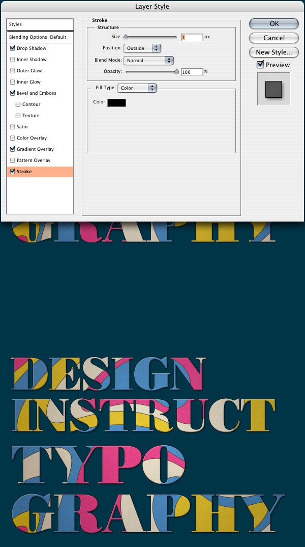
Step 14: Adding a Stroke layer style
The last thing we are going to do to the text for now is go into the Layer Styles dialog box again and add a 1px black stroke to the text via a Stroke layer style. This will tie in our text with the shapes in the background, which also have strokes on them.
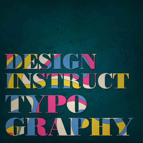
Step 15: Background darkening
We are going to work on the background now. First, we are going to darken the edges of the canvas to create a shadow.
Create a new layer (Ctrl/Cmd + Shift + N) and move it just above the background layer in the Layers Panel.
Get the Rectangular Marquee Tool (M) and change the Feather option (at the top of the screen in the Options Bar) to 100px.
Click and drag a box around the entire canvas and then get the inverse selection with Ctrl/Cmd + Shift + I (which is the same as Select > Inverse).
Fill the area with black (#000000).
Drop the opacity down to 30%.
Your result should look similar to what I have below.
Step 16: Background lightening
We are going to give the background a slight white opacity gradient in the middle of the canvas to give a sense that there is a light source coming directly above.
Choose the Background layer in the Layers Panel, click on the Add a layer style icon, and add a Gradient Overlay layer style. Change it so that it is white on the left side with 100% opacity and white on the right with 0% opacity.
Step 17: Creating an old textured background
Our background is going to have an old textured look. We are going to achieve this look by layering a few textures to get what we want.
First, we need to get the collage texture from Zen Textures.
Use Free Transform (Ctrl/Cmd + T) to fit the texture into place (holding down the Shift key to keep the texture from getting skewed disproportionately).
Move the texture so that it’s just above the Background layer and change the Blend Mode to Multiply.
Change the opacity of the layer to 50%.
Step 18: Adding and processing a paper texture
The next texture we are going to use is the stained paper texture from Zen Textures.
Bring the texture into our document and resize it.
Change the Blend Mode of the layer that the texture is in to Multiply.
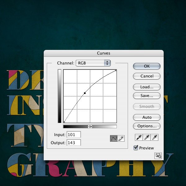
Now since this makes our art piece too dark, we are going to lighten it with the Curves tool. Use Ctrl/Cmd + M to open up the Curves tool dialog box and create a curve like what I have below.
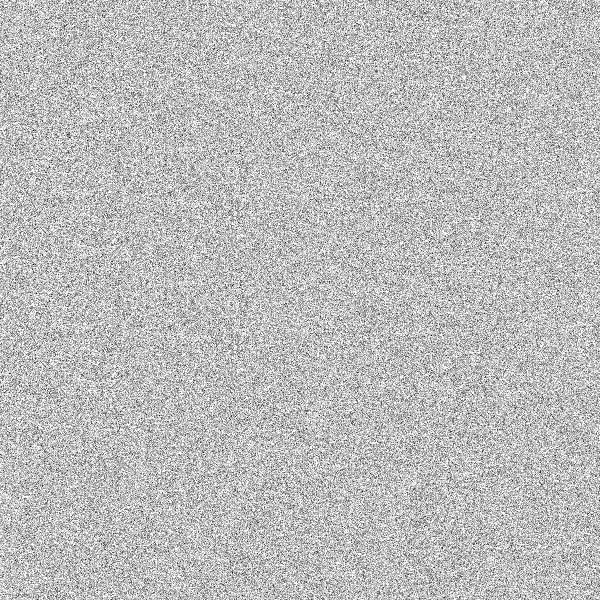
Step 19: Adding noise
We are going to add some noise to the image to give it an overall older/aged look.
Create a new layer and fill it with white (#ffffff).
Go to Filter > Noise > Add Noise and change the amount to 103%, Uniform Distribution, and make sure Monochromatic is checked.
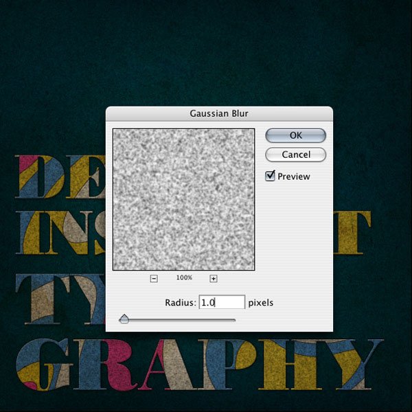
Step 20: Blurring the noise
Change the Blend Mode of the noise layer to Multiply.
Go into Filter > Blur > Gaussian Blur and change the Radius to 1.0px.
Drop the opacity of this layer to 40%.
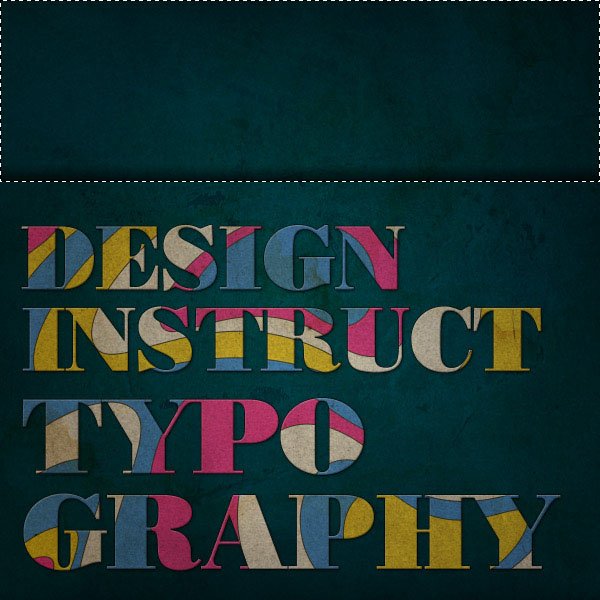
Step 21: Creating the crease shadow
To finish it up, we are going to create a crease in the background that will frame the top of the text.
Using the Rectangular Marquee Tool (M) with the Feather option at 0px (which is the default, but we changed it earlier on to 100px), create a box marquee selection at the top of the canvas.
Click on the Gradient Tool (G) and make a small black gradient with the darkest part coming from the bottom of the box like I have below.
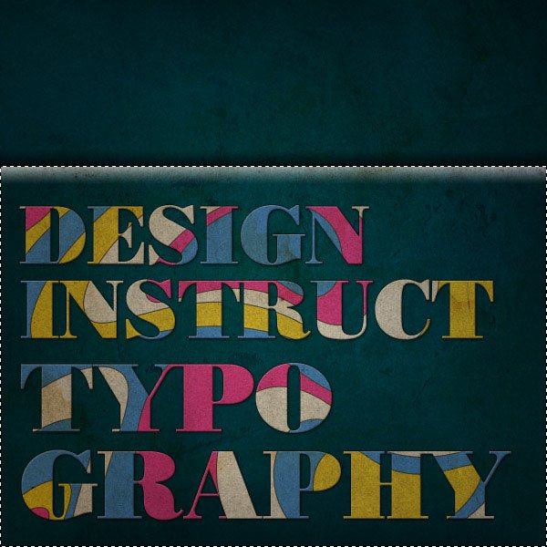
Step 22: Creating the crease highlight
Press Ctrl/Cmd + Shift + I to get the inverse selection.
Create a new layer (Ctrl/Cmd + Shift + N) and add a white gradient with the Gradient Tool (G) so that the brightest part is at the top of the box. The darkest black and brightest white gradients should meet.
Step 23: Making the crease more subtle
Drop the opacity of the black gradient layer to 50% and the white gradient to 20% so you get a more subtle crease.

Step 24: Masking out the crease
If you want to make the crease fade away on the right side of the canvas like I have below, click on the empty box on to the left of the two gradient layers in the Layers Panel (this should bring up a chain link icon). Ctrl/Cmd + E will merge the two layers together.
Click on the Add layer mask icon and, using the Brush Tool (B) with a black, 0% hardness brush tip at 20% opacity, start slowly brushing away the crease on the right side until you get something you like.
Conclusion
There we have it folks, a technique for creating some funky retro text reminiscent of the 70’s.
I hope you liked this tutorial and encourage you to share your thoughts in the comments.
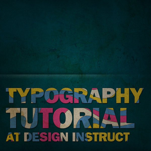
Here’s an alternative version:
Download Source Files
- wavy_retro_text (ZIP,15.6 MB)
-
 Trevin serves as the VP of Marketing at WebFX. He has worked on over 450 marketing campaigns and has been building websites for over 25 years. His work has been featured by Search Engine Land, USA Today, Fast Company and Inc.
 -

WebFX is a full-service marketing agency with 1,100+ client reviews and a 4.9-star rating on Clutch! Find out how our expert team and revenue-accelerating tech can drive results for you! Learn more
Make estimating web design costs easy
Website design costs can be tricky to nail down. Get an instant estimate for a custom web design with our free website design cost calculator!
Try Our Free Web Design Cost Calculator
Table of Contents
- Preview
- Resources
- Step 1: Creating the Shapes
- Step 2: Adding More Shapes
- Step 3: Adding Even More Shapes
- Step 4: Adding a Stroke to the Shapes
- Step 5: Creating the Text Background
- Step 6: Finishing the Text Background
- Step 7: Adding a Retro Look
- Step 8: Merging the Layers and Adding Text
- Step 9: Masking the Text Background
- Step 10: Coloring the Background
- Step 11: Adding a Drop Shadow Layer Style
- Step 12: Adding a Bevel and Emboss Layer Style
- Step 13: Adding a Gradient Overlay Layer Style
- Step 14: Adding a Stroke Layer Style
- Step 15: Background Darkening
- Step 16: Background Lightening
- Step 17: Creating an Old Textured Background
- Step 18: Adding and Processing a Paper Texture
- Step 19: Adding Noise
- Step 20: Blurring the Noise
- Step 21: Creating the Crease Shadow
- Step 22: Creating the Crease Highlight
- Step 23: Making the Crease More Subtle
- Step 24: Masking out the Crease
- Conclusion
- Download Source Files
Share this article


Web Design Calculator
Use our free tool to get a free, instant quote in under 60 seconds.
View Web Design CalculatorMake estimating web design costs easy
Website design costs can be tricky to nail down. Get an instant estimate for a custom web design with our free website design cost calculator!
Try Our Free Web Design Cost Calculator


