
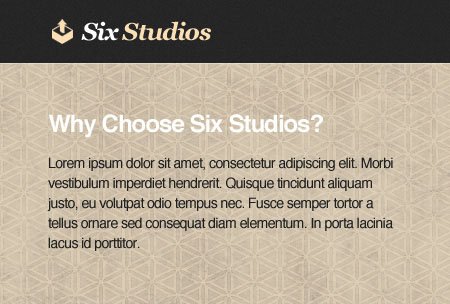
Preview
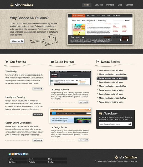
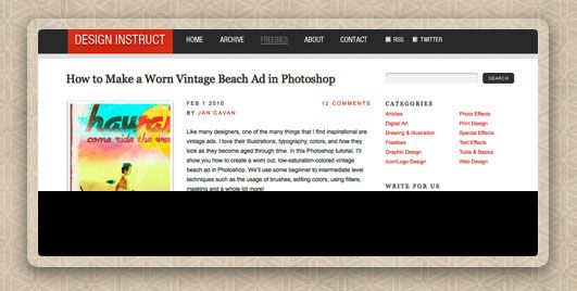
Click on the image below to see the web design mock-up in full scale. This web design is professional and user-friendly, so it should be great for your businesses web reputation. 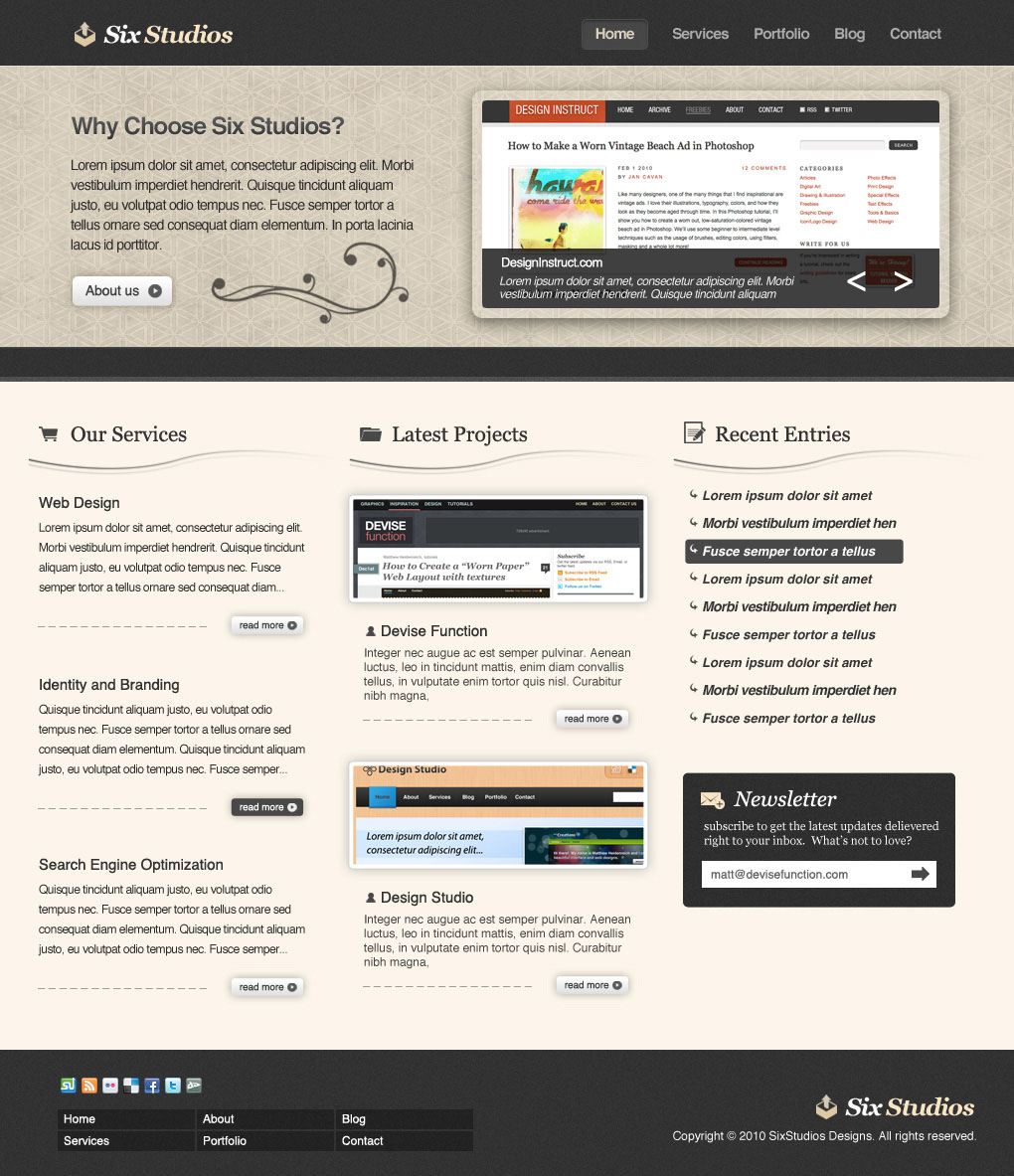
Working Demo
Click on the image below to see the working demonstration (which you can download at the bottom of this tutorial).
Resources
- Vector Social Media Icons by IconDock
- Grungy Natural Beige Photoshop Pattern by Webtreats
- Floral Brushes by Vasiliy Orlov
- Mono Icons by Jason Cho
Step 1: Set up the Photoshop document
The first thing we need to do is create a new Photoshop document to work with. For this web design layout, make a new document with the dimensions of 1020x1180px. 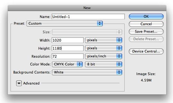
Step 2: Make the navigation bar background
We want to start at the header and then work our way down to our footer.
Using your Rectangular Marquee Tool (M), create a rectangle marquee selection that spans the entire width of the canvas; then fill it (Cmd/Ctrl + F5) with a dark gray color (#393939). 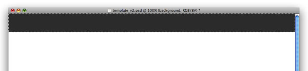
Step 3: Stylize the navigation bar background
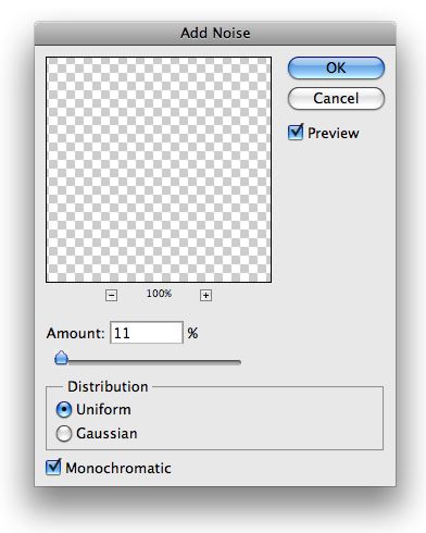
Replicate the navigation bar background layer that you just created by hitting Cmd + J; this duplicates the layer. Apply a noise filter (Filter > Noise > Add Noise) on the duplicated layer; note that we should use a uniform noise distribution so that the background can be tiled for later use.
 Then change this layer’s blend mode to Overlay and lower the opacity to around 23%.
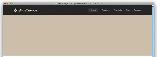
Step 4: Create the site’s logo/name
For our logo, I used the font Georgia set to Bold Italic. I used white as the text’s color (#FFFFFF) for ‘Six’ and a beige-tan color (#F7E5C4) for ‘Studios’.
For the logo/site name’s icon, I used the boxupload32 icon from the free Mono Icons listed in the resources at the top of this page. 
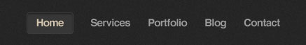
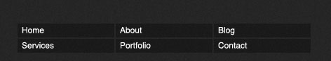
Step 5: Add the menu links
It’s time for our horizontal navigation links. Our active link will use the color #DBD1BE, and our non-active links will be #ABAAAA.
 To make our active link stand out a bit more, make a rounded rectangle behind it. Using your Rounded Rectangle Tool (U) from the Tools Panel with the Radius option set to 5px and your foreground set to #464646, make a rounded rectangle shape as shown below.
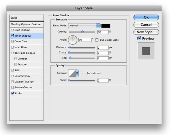
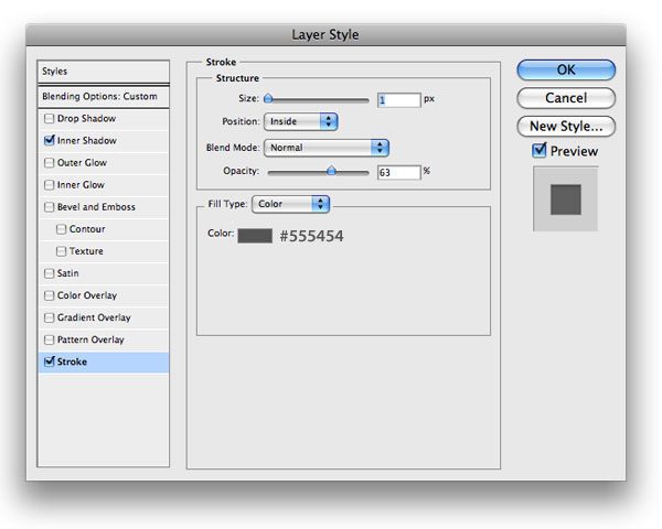
 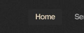 On your rounded rectangle shape layer, add an Inner Shadow and a Stroke layer style by right-clicking on the layer and choosing Blending Options from the contextual menu.
Inner Shadow settings:
Stroke settings:
Step 6: Add the background of the featured area
On the top portion of our web layout, there will be a featured area that has an image slideshow so that users can navigate and view through your featured works. This area will also house a little description about your site. To start things off, we want to use our Rectangular Marquee Tool (M) to make a rectangle that denotes the background of this featured area, filling it in with the color: #D3CAB8.
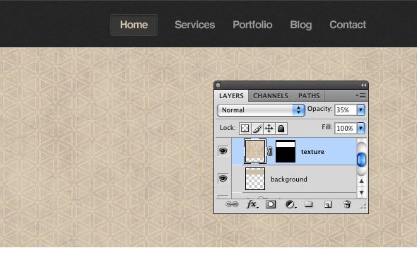
 Next, download and open the Grungy Natural Beige Photoshop Pattern (or a pattern of your choice) in Photoshop. Drag the texture onto your main canvas, over the featured area’s background.
Step 7: Mask out unwanted portions of the background texture
You are going to end up having a lot of texture that we do not want to be showing, so we want to mask out what we don’t need.
To do this, Cmd/Ctrl + click on the thumbnail of your featured background layer in the Layers Panel to make an automatic selection. Select your texture layer from your Layers Panel, and then click on the Add layer mask button at the bottom of the panel to mask out everything but the selected area. Then change your texture layer’s opacity to about 35% to let the layer below show through.
 Using the Horizontal Type Tool (T), add some text in this featured area using Helvetica or Arial. Make sure to put the heading text and the body text on their own distinct layers. For our heading text, I used white as the color (#FFFFFF), and for the body text, a light-gray color (#2A2A2A).
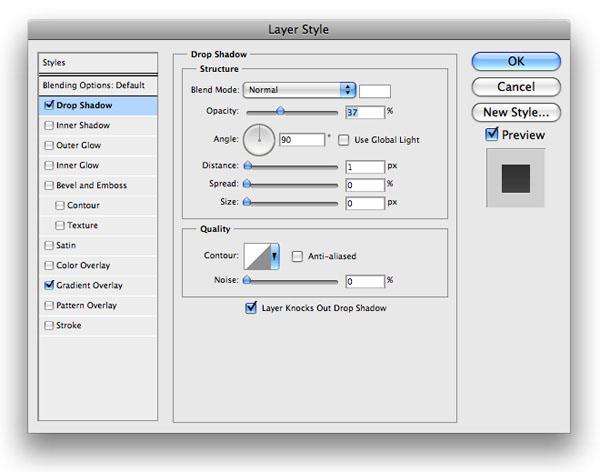
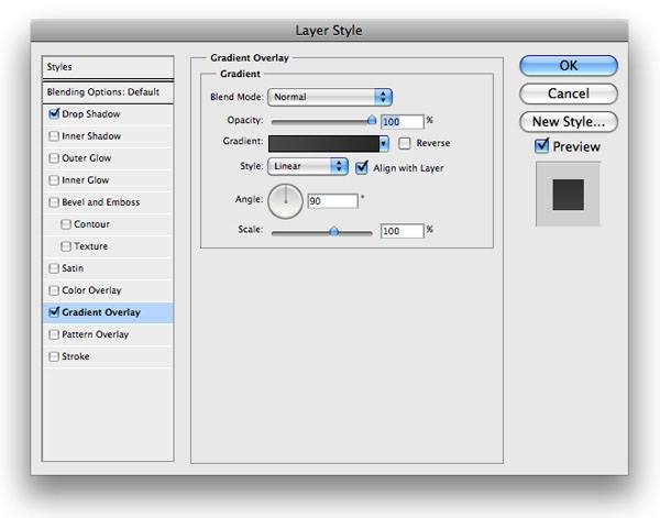
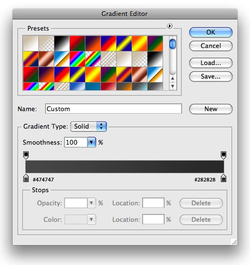
 To spice up the heading text, give it a drop shadow and a color gradient, which produces an inset type effect.
Drop Shadow settings:
Gradient Overlay settings:
Step 8: Create the “About us” rounded corner button
For the “About us” interface button, use the Rounded Rectangle Tool (U) again with a radius of 5px. The text on top of your button can use the color of #404040.
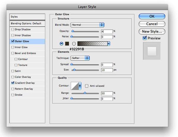
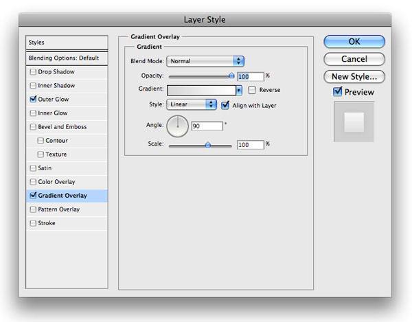
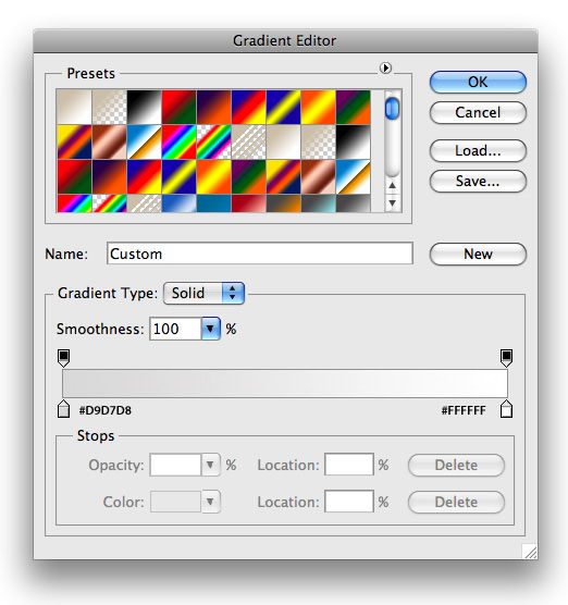
You can find the arrow icon I used (it’s called circleright32) in Mono Icons. Resize the icon to fit the button you created using the Free Transform command (Cmd/Ctrl + T). 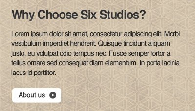 On this rounded rectangle shape layer, add an outer glow and a color gradient to make the shape more interesting.
Outer Glow settings:
Gradient Overlay settings:
Step 9: Add a florish design element
The last step for this side of our featured area is adding a florish; a subtle design element that enhances the elegant and classy look-and-feel of our web design. First, download and install the Floral Brushes brush pack (listed in the Resources section above). Set your foreground color to #343434 before you apply your brush.
Choose the Brush Tool (B), find a floral brush tip that you like in the brush pack we installed, and apply your brush stroke with one click. Afterwards, change the layer’s blend mode to Hard Light. 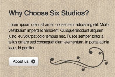
Step 10: Create the slideshow area
Let us work on our slideshow content area.
Use your Rounded Rectangle Tool (U) with a foreground set to white (#FFFFFF) and a radius of 5px to generate a rounded rectangle shape on the right side of the web layout. 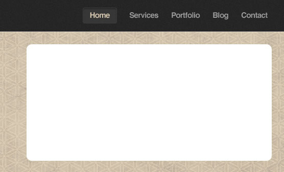 Change the fill on this layer to 15% to let some of the background pattern show through, and then add a drop shadow on the shape.
Step 11: Add an image for the slideshow area
We need to add a thumbnail to our box at this point.
Take an image that you can use in this area (such as a screenshot of a website), and place it over the area. We want the corners to be rounded. In the Layers Panel, Cmd/Ctrl + click the thumbnail preview of the rounded rectangle shape to make a selection.
Still in the Layers Panel, choose the layer with your image on it. Go to Select > Modify > Contract and contract the marquee selection by 10px. Then choose Select > Inverse (Cmd/Ctrl + Shift + I) to invert your selection.
To give the image rounded corners, choose Edit > Clear. Be sure to optimize the images you use! 
Step 12: Add a description of the image being shown
Let’s add a description of the image being currently shown in the slideshow area.
Create a marquee selection around the image by Cmd/Ctrl + clicking on its layer’s thumbnail preview in the Layers Panel. After it is selected, create a new layer and fill your selection with black (#000000). Then use your Rectangular Marquee Tool (M) to select the top portion of your newly created rounded black rectangle and delete it.
 Lower the opacity of this layer to about 75% to let your image layer show through. To finish it off, add some text to describe the image using the Horizontal Type Tool (T).
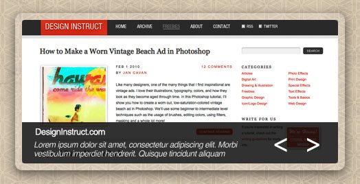
Step 13: Add a divider at the bottom of the featured area
The last step for our featured area is to add a gray, horizontal divider at the bottom of it.
We want to follow the same method as Step 2 and Step 3 for creating this divider; the only thing that changes is adding an inner shadow into it. 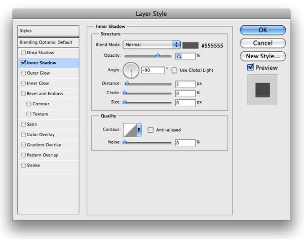 Here’s our featured area fully completed:
  Time to move on to our main content area.
Step 14: Add color to the background of the main content area
Just as you may have guessed, our content area will house the three columns shown in the preview of our web design.
We don’t want to be boring and leave the background white, though; so create a marquee selection with the Rectangular Marquee Tool (M) that spans the entire width of the canvas, filling it with an off-white color (#FBF5EA). 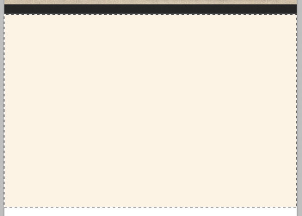 Our content area is going to be fairly simple, but simple goes a long way if done correctly. We will start with the left side—the side where we will place the list of services.
Step 15: Add column headings
For our column headings, pick symbolic representations of the content that the column will have from the Mono Icons and position them to the left. I used the font Georgia and a dark gray color (#323232) for the column heading text. Next, add a bottom border below the column headings using the Pen Tool (P).
Create a path as shown below. 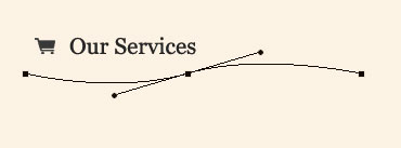 Apply a stroke to the path by first setting your foreground color to the same color as the text (#323232). Then find a nice brush tip with the Master Diameter option at 3px.
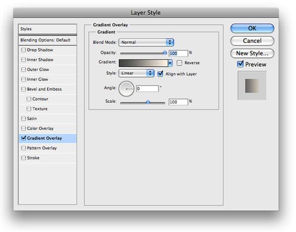
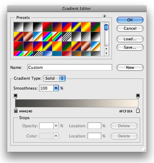
On a new layer, go to your Paths Panel (Window > Paths) and click on the Stroke path with brush button at the bottom of the panel. 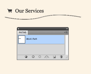 Next, we want to give a little bit of a gradient to our curvy line. Do this by adding a gradient overlay layer style.
 Duplicate your curvy lines layer (Ctrl/Cmd + J), and then nudge it 4 or 5px below the original line. Lower the opacity of it to around 24%.
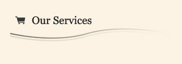
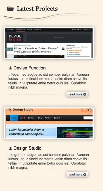
Step 16: Add content to the left column
All that is left for the left column is to add its content.
Our header text color is set at dark gray (#323232). For the body text, use a readable shade of gray (such as #2A2A2A). Use the same process in Step 8 for making the “Read More” interface buttons.
However, for the middle row, I wanted to switch up the color, so I made it a solid-colored gray (#484848) rounded rectangle to present my proposed hover state of these buttons in the web design mock-up. 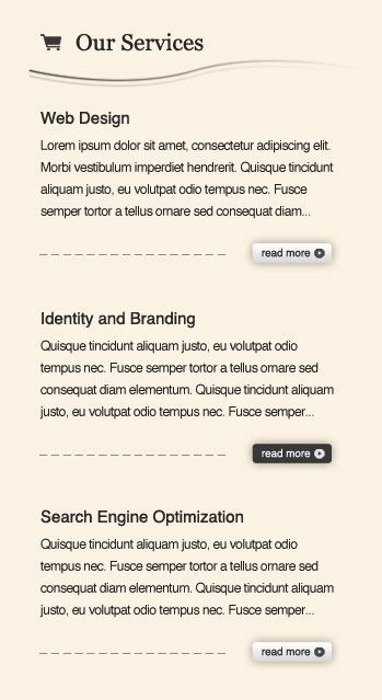
Step 17: Add content to the middle column
With the left column complete, it only makes sense to move on to the center. Create the same heading as we did for the left column, but change up the icon with one that you find suitable.
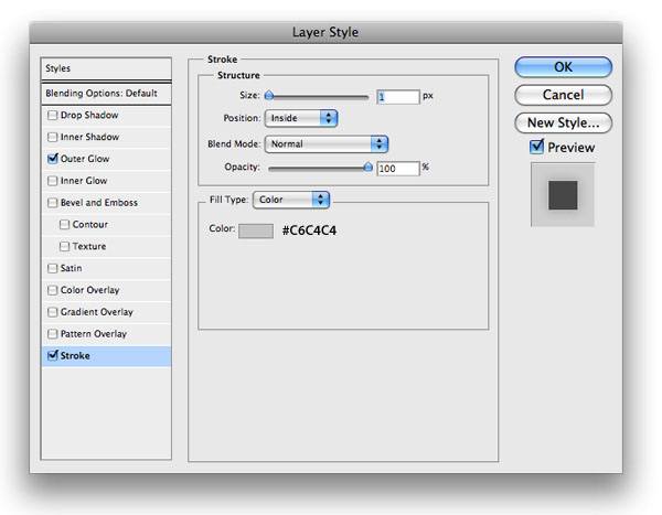
Using your Rounded Rectangle Tool (U) with a radius of 3px and a white foreground color (#FFFFFF), make a small rounded corner content box and lay out some text and description. 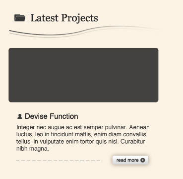 Then apply an outer glow and a stroke layer style to your rounded corner content box.
Outer Glow settings:
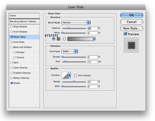
Stroke settings:
 To finalize the rounded corner context box, add an image to match your description.
Step 18: Add content to the right column
The right column is very similar to how the left and the center columns are arranged. We want to create the same heading for the other two, using a different icon that is symbolic of the content in this column. For the non-active links, I used a dark gray font color (#353535).
For our active links, I used plain, old white (#FFFFFF). Behind our active link, I created a background using the Rounded Rectangle Tool (U) with a 3px radius and the same dark gray color as our non-active links (#353535) to make it stand out. 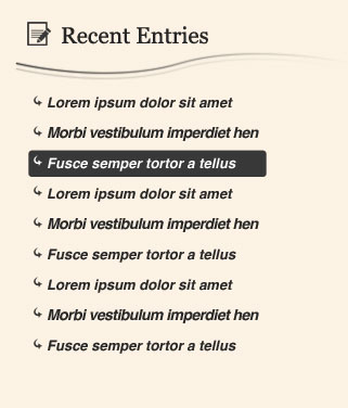
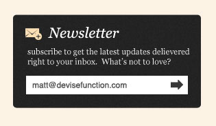
Step 19: Design the Newsletter widget
Next, we need to create our Newsletter widget.
Use your Rounded Rectangle Tool (U) with a radius of 3px to create the box. In this rounded corner box, apply the same process as in Step 2 for creating the noisy, gray background so that we can reuse the design element from the navigation bar in our web layout.  All you need to do now is add some content to your Newsletter widget.
The font for the heading is Georgia Italic, and the icon is, again, from Mono Icons. I placed a Color Overlay layer style using a beige color (#F7E5C4) on the icon to make it blend in a little better on our web layout’s color scheme. Then just use your Rectangular Marquee Tool (U) to make a rounded rectangle to serve as the input field for the email address of the user; use a fill color of white (#FFFFFF).
 That is it for our main content area! Time to move on to the final section of our web layout: the footer.
Step 20: Adding the background of the footer
The footer is going to be made exactly like the header navigation background from Step 2 and Step 3. You will want to make it a little taller than your navigation, though, so that it can accommodate more content. 
Step 21: Add the content of the footer
Next, add some links to our footer. Using your Rectangular Marquee Tool (M), create a rectangle and fill it with a dark gray color (#323232).
Then place some white-colored text (#FFFFFF) in the box for your link. 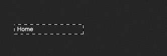 Now change the blend mode of your rectangle’s layer to Soft Light and lower the opacity to 63% to let the footer’s background show through. Repeat this process for as many links as you need.
 The last thing we need to do is to add our social media icons above our footer’s navigation menu and then add our logo and copyright text to the right side of our footer. The social media icons used comes from the Vector Social Media Icons.
 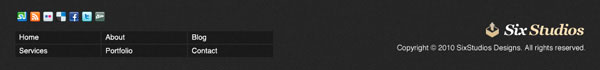 That’s it!
Conclusion
I hope you found this tutorial helpful and easy to follow. This design is professional and unique so it should be good to use for sites from a variety of industries; from a golf course to an HVAC business. If you have any questions, please do not hesitate to ask in the comments.
If this tutorial inspires you, show off your work in the Design Instruct Flickr group.
Download Source Files
- PSD file: clean_classy_webdesign_psd (ZIP, 3.17 MB)
- Web template: clean_classy_webdesign_template (ZIP, 0.41 MB)
-
 Trevin serves as the VP of Marketing at WebFX. He has worked on over 450 marketing campaigns and has been building websites for over 25 years. His work has been featured by Search Engine Land, USA Today, Fast Company and Inc.
 -

WebFX is a full-service marketing agency with 1,100+ client reviews and a 4.9-star rating on Clutch! Find out how our expert team and revenue-accelerating tech can drive results for you! Learn more
Make estimating web design costs easy
Website design costs can be tricky to nail down. Get an instant estimate for a custom web design with our free website design cost calculator!
Try Our Free Web Design Cost Calculator
Table of Contents
- Preview
- Working Demo
- Resources
- Step 1: Set Up the Photoshop Document
- Step 2: Make the Navigation Bar Background
- Step 3: Stylize the Navigation Bar Background
- Step 4: Create the Site’s Logo/name
- Step 5: Add the Menu Links
- Step 6: Add the Background of the Featured Area
- Step 7: Mask out Unwanted Portions of the Background Texture
- Step 8: Create the “About Us” Rounded Corner Button
- Step 9: Add a Florish Design Element
- Step 10: Create the Slideshow Area
- Step 11: Add an Image for the Slideshow Area
- Step 12: Add a Description of the Image Being Shown
- Step 13: Add a Divider at the Bottom of the Featured Area
- Step 14: Add Color to the Background of the Main Content Area
- Step 15: Add Column Headings
- Step 16: Add Content to the Left Column
- Step 17: Add Content to the Middle Column
- Step 18: Add Content to the Right Column
- Step 19: Design the Newsletter Widget
- Step 20: Adding the Background of the Footer
- Step 21: Add the Content of the Footer
- Conclusion
- Download Source Files
Share this article


Web Design Calculator
Use our free tool to get a free, instant quote in under 60 seconds.
View Web Design CalculatorMake estimating web design costs easy
Website design costs can be tricky to nail down. Get an instant estimate for a custom web design with our free website design cost calculator!
Try Our Free Web Design Cost Calculator


