Posted on February 19th, 2011
10816 views
Sakura in the Wind
A Digital Painting Tutorial for a Nature Scene Painted in an Anime or "Painted" Style
Tools:
Adobe Photoshop CS3
Bamboo Fun Wacom Tablet
Pruzjinka Brushes
Mynti Brushes
(OR) Various Leaf Brushes
Foreground
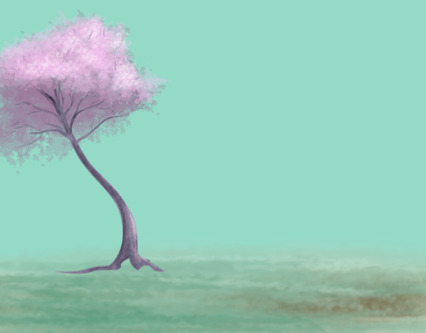
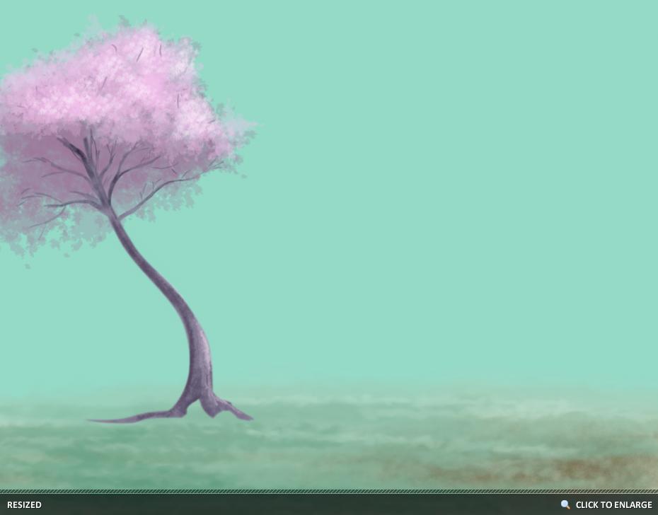
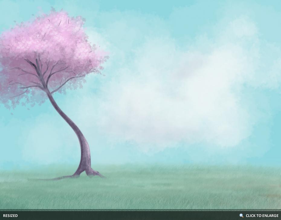
- For work space, I began with a wider canvas (1704 X 1333). For the background, I chose an Aqua color. I find it easier to work on a colored canvas than on a plain white canvas.

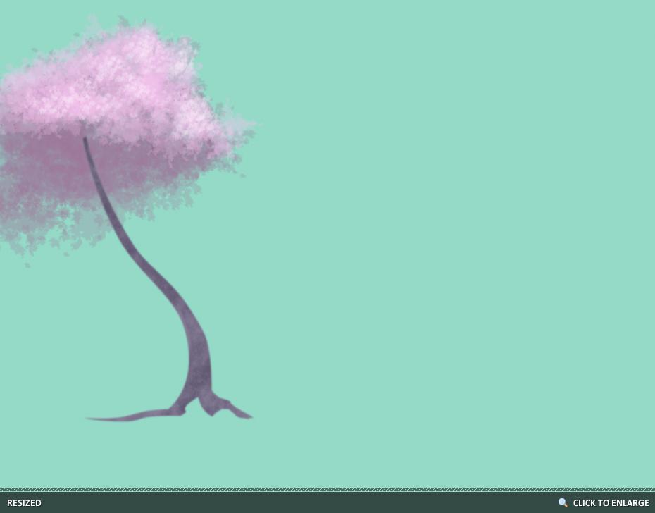
- On a new layer, I began painting the Tree Top. I started with a Deeper Purple for the base, and a Light Pink for the Top Leaves. I chose for a light source coming from the Top Right of the viewer. Notice how the Light Pink allows some dark spaces to show through, and the Dark Purple allows some of the background to show through. Trees do not always block out light completely. The brushes used here were a variety of different shapes.
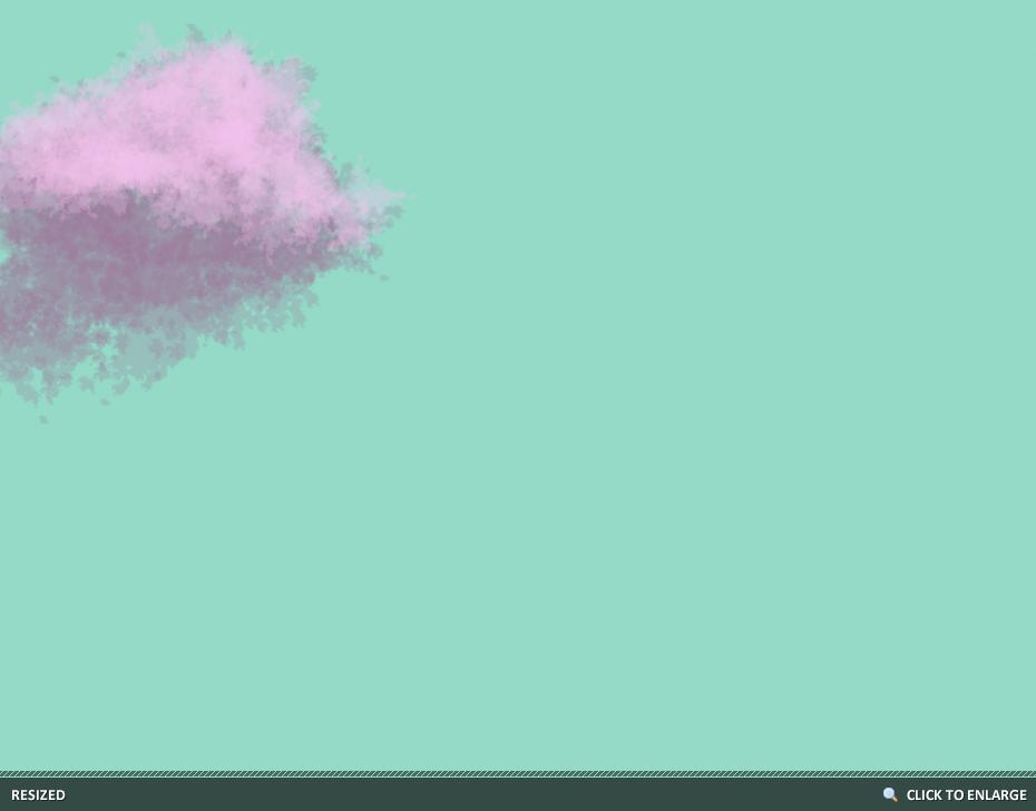
- For the highlights, I chose an almost White Pink and a smaller, more defined Leaf Brush. Check your Brush's Settings and be sure that your Brush's Scatter and Angle Jitter are at the right settings for what you need. Decreasing your scatter is great for small clusters, and Increasing your scatter is great for Wide Areas. I did everything up to this point with a mouse.
- For the Trunk, I selected a Desaturated Purple and used the Pen Tool to draw a basic outline of the Tree Trunk. For a softer edge, select Make Selection, then Feather and feather your selection by 1 to 2 Pixels.

- Each of these changes were done on a separate layer, take the time to merge layers that you are happy with and clean up edges with the Eraser. For the next part, I chose a Chalk Brush with a Low Opacity to paint the Trunk Detail. I used the Eraser to clean up the edges along the outside of the Trunk, at this point, start defining where you will want shadows and highlights to appear.
- For the Limbs, I used the Tablet to Paint limbs stretching out in each directions, including some taller ones that were meant to look like they were behind or in front of the Trunk. I did not take as much time as I should on the limbs, knowing that the image was not going to be viewed Full Size. You may want to spend more time. Use Liquify to pull the limbs into a pointier edge if your Brush wasn't the right size.
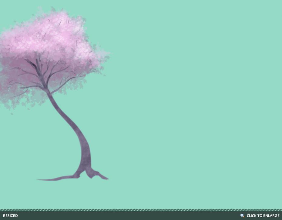
- For more intense Highlights and Shadows, you can use the Dodge and Burn Tools. I used them set on Midtones with a Low Exposure. Again, I used a Smaller Chalk Brush with a Low Opacity to paint in more Highlights and Shadows. This is where I defined the sunlight hitting the trunk and darkened sections of the limbs and roots.
Foreground - Grass
Layers and Groups at this point.
Foreground Trees (Group)
Leaves Detail
Leaves Base
Trunk Detail
Trunk
Foreground Grass (Group)
Grass Detail
Grass Base
Soil
Sky (Group)
Plain Blue BG
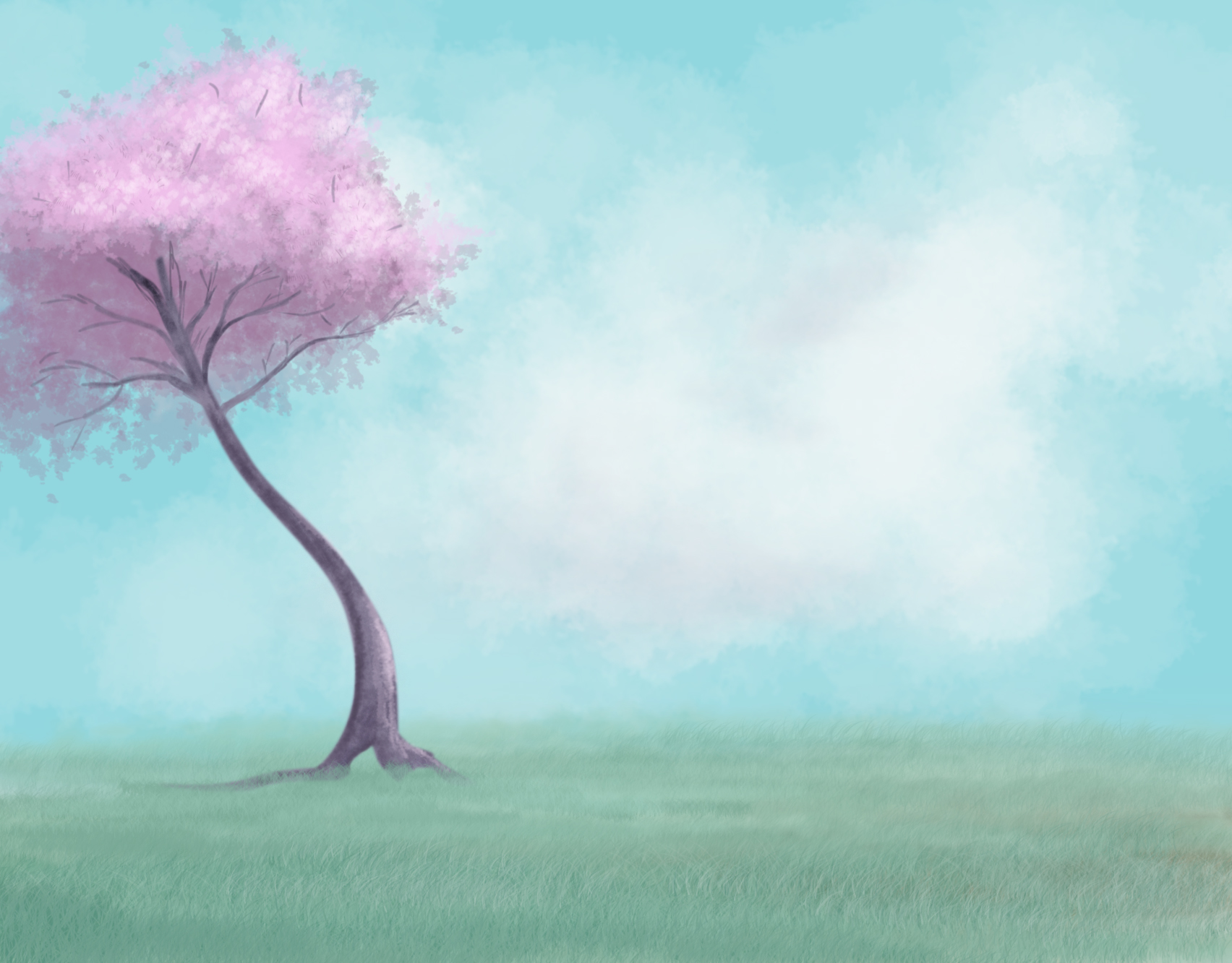
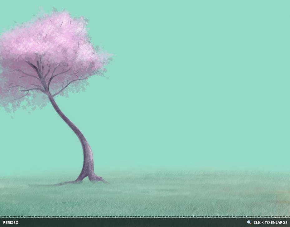
- Your landscape may need a soil base, this will help prevent any sky from "leaking through" and showing, and can also help create a more natural look. I chose a Chalk Brush with a Medium Opacity and quickly painted where I wanted the ground to appear. I used two different shades of Brown, and didn't bother to paint in the corner where I knew I would be cropping the image.
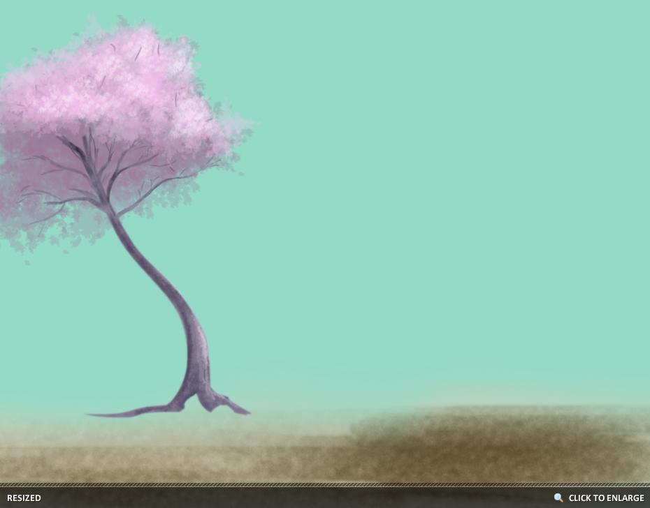
- For the Grass Base, I used the same Chalk Brush on Medium Opacity, again, with a few different shades of green. There is no real technique to this part, unless you want to begin marking where you will want your highlights and shadows to appear in the grass. I faded the grass into the horizon to avoid a harsh line. You can do this by using a lower opacity or by simply erasing with a very soft brush.
- For the grass, I used the Photoshop Grass Brush. If you are unfamiliar with the Grass Brush, you will need to set your Background and Foreground Colors to different shades of green, preferably a Medium Shade and a Deeper Shade such as basic Green and Forest Green. Check your Brush's settings in case you want to Flip the X Jitter. This will allow the grass blades to flow from both Left to Right and Right to Left. Towards the horizon I used a much smaller size Grass Brush, and towards the viewer a larger size. I used similar toned Greens towards the horizons and more contrasting greens towards the viewer to create more "detail".
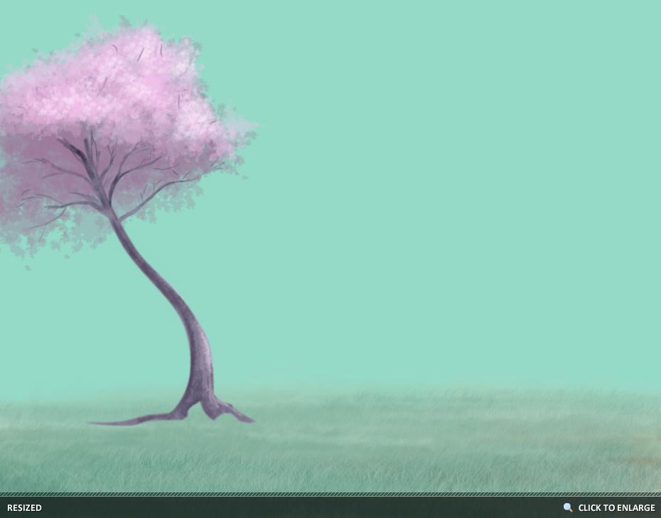
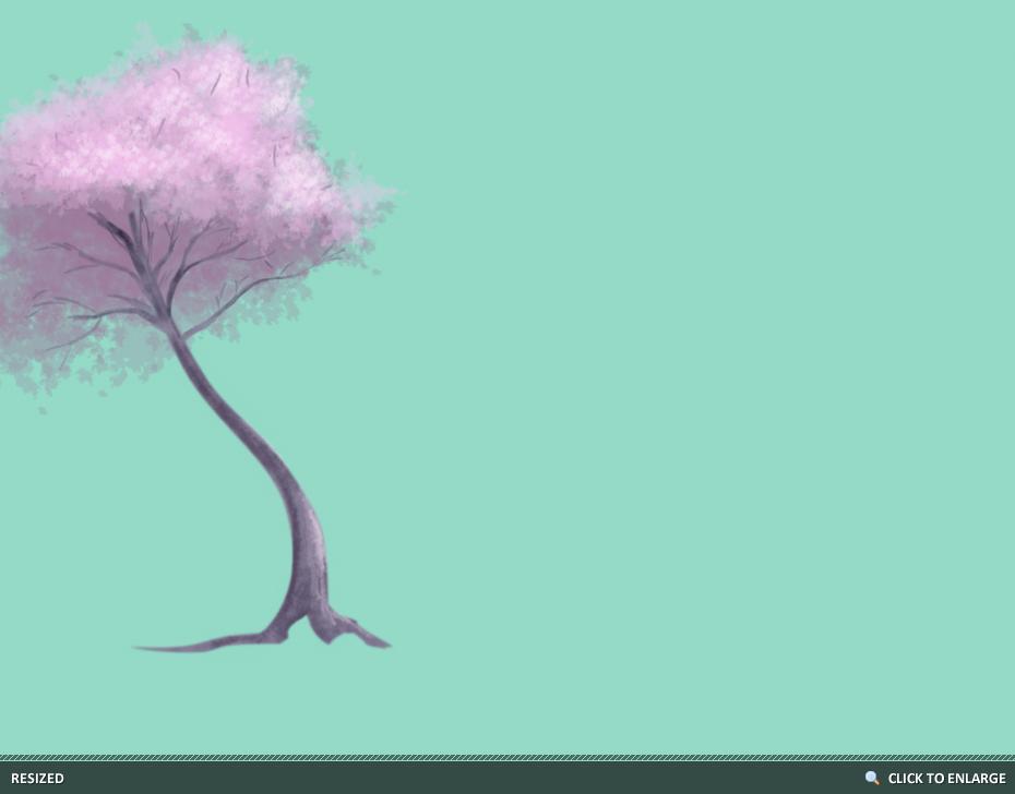
- Even if your painting doesn't include roots, you will want to blend the trunk into your landscape. I did this using the same colors and Grass Brush as the mid-level on its own layer above the Tree Group. Again, no real technique except color matching. This shouldn't be difficult if you want the Grass over the Roots at the same time you paint the mid-level grass.
Background - Sky
- To begin, I changed the sky color to a more appropriate Blue. I then chose a soft Light Blue with a Fluffy Cloud Brush (any soft brush will do) and painted the clouds with a very low Opacity. I used a dotting method to build the clouds, instead of a sweeping method. For this style, I chose not to create clearly defined clouds.
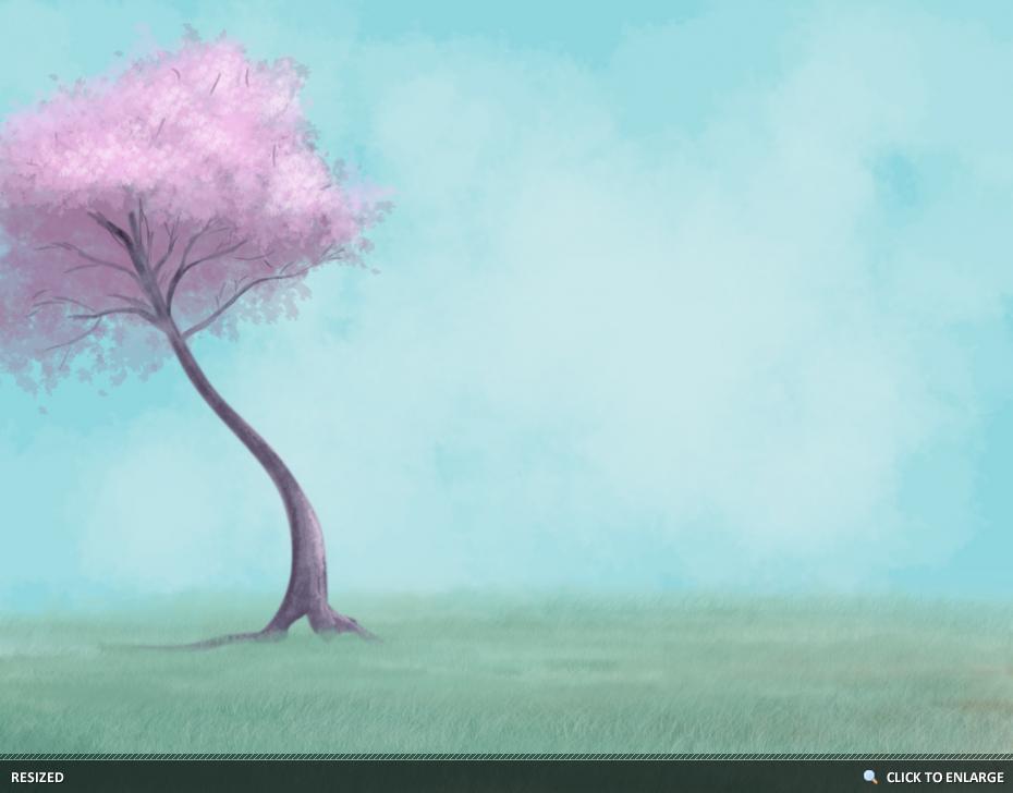
- The Shadows and Highlights were painted in almost White Blue, Deep Purple and Deep Blue. If your colors are too dark, try lowering your layer's opacity or erasing with a low opacity Eraser. The clouds do not need to be clearly. I used the same dotting method to build up the shadows.
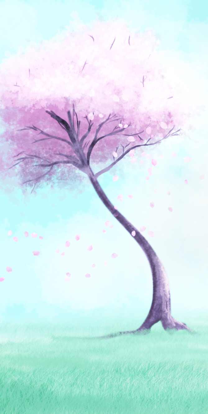
Foreground - Falling Leaves and Crop
- I like to apply final details to a Cropped Image. I chose a tall crop that mimics a Japanese scroll. For the Leaves, I used a single Leaf Brush and painted three strips of leave falling on three different layers. I then erased certain leaves that looked out of place and painted a simple line down the center of each falling leaf. The three different "strips" were painted in different shades of Pink and Purple.

- The Falling Leaves still needed some detail, so I went into Blending Options and applied a Pattern Overlay and set it to Soft Light. The leaves were painted in the Tree Group, so as not to confuse anyone.
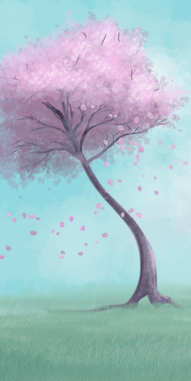
- To complete the lighting effect that I had originally intended, I applied a Curves Adjustment Layer above all Layers and lightly masked away sections that blew out sections of the clouds.
I do hope you found this helpful! To Download a Series Progression, you can view Sakura in the Wind.

Dig this tutorial?
Thank the author by sending him a few P2L credits!
Kim Stafford
Kim Stafford is a freelance graphic designer, photographer, model and photo-editor.
|