Design a Silhouette Style Flyer in Photoshop

Silhouettes are a powerful way to make your designs more interesting and memorable. One of the keys to successfully incorporating silhouettes is to make sure your shapes are as highly detailed as possible.
In this tutorial, we will be designing an event flyer that uses silhouettes to achieve a nostalgic feel. Let's get started.
What We Will Be Making

Step 1
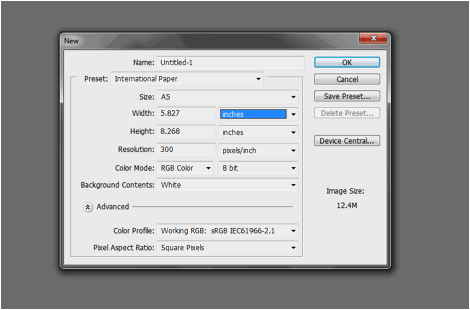
First, we need to setup a print-ready flyer document. This is done through the new document settings window. Once you press CTRL+N in Photoshop, you should see this window. Here you can set the width and height dimensions for the flyer as well as the resolution. In our example, we are going to use an A5 sized flyer. Just choose from the "International paper" presets and then select A5 as the size. Make sure the resolution is at 300ppi for high quality printing.
Step 2
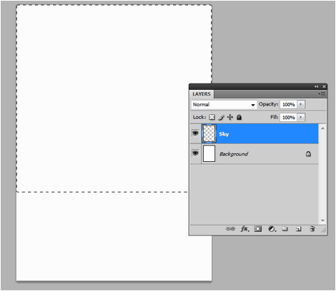
Now, that the new document is open, we shall setup our backgrounds. Our background for this design has a darker lower area and a lighter upper area. This will help us establish that silhouette effect. First though, we will just add so that they are easier to identify. So first, create a new layer by pressing CTRL+SHIFT+N. Name this "Sky". Then use the rectangular marquee tool to select a large part of the upper area (around 2/3rds of the design).
Step 3
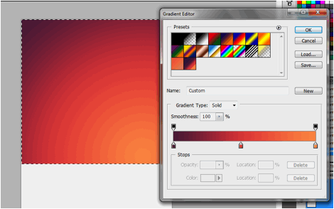
Now, using the Gradient Color tool, we put in a nice gradient that goes across the selected area diagonally. Of course, keep in mind that you can change the color of the gradient to any theme color that you want. For our example we are using a purple, light red and light orange color theme, which is a nice "dusk" type theme color.
Step 4
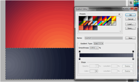
Next, we will create the "ground" area. In fact, we will create a kind of water or lake area at the bottom where our silhouettes will reflect to later. To do this, we create a new layer (CTRL+SHIFT+N) and name it "Ground". Press CTRL+SHIFT+I to invert our current selection. Then just like before we color this layer with a gradient color. This time we choose a "Shale" type blue color and a dark blue as the gradient colors. We inscribe it diagonally across our layer.
Step 5
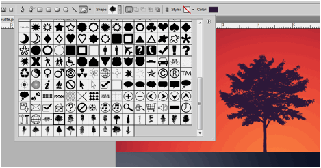
Great! Now we are ready to add our silhouette shapes. For our example, we are going to use some free silhouette shapes/vectors. First up, we used the free vector tree shapes from this very generous site. You have two options, either use the .AI file to open in illustrator and copy paste the vectors, OR you can use the .CSH file to add the custom shapes into Photoshop. Whatever the case, once they are in Photoshop, simply scale and place them on top of our sky layer to achieve the basic silhouette effect. In our case we installed the shapes and used the custom shapes tool.
Step 6
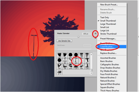
Next, we will place in a street lamp shape. Now, we could not get any free vector shapes of these easily, but there is a Free brush type shape from this generous deviant art user here. So we download this and load it up as a custom brush in Photoshop. To do this, just select the brush tool, and right click on the document area to bring up the brush menu. Click on the right arrow icon to get to its menu options and select "Load Brushes". Choose the shape the brushes that you downloaded from above to load them as an option. Then just create a new layer (name it "lamp") and then just brush in our street lamp shape with the same color as our tree.
Step 7
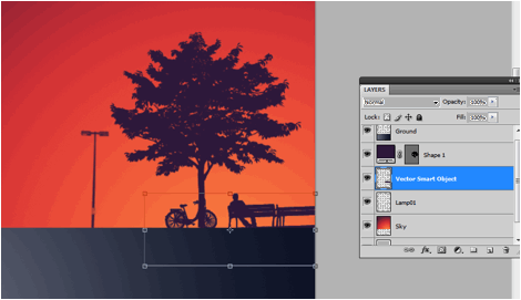
Afterwards, we will add a silhouette of a park bench, with a man and a bike. We opened this up in Adobe Illustrator, and then copy-pasted the shape over to Adobe Photoshop. We pasted them in as a "Smart Object" and scaled it down appropriately. We scaled it down by transforming it via the (CTRL+T) transform shortcut. Remember to hold down the SHIFT key as you scale down shapes to maintain its proportions. Once scaled down correctly, we rasterize it and then we color it with our theme color, the same as the tree and the lamp post.
Step 8
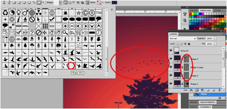
As the final silhouette shape, we use the bird vectors from "all silhouettes". We just install them as shapes just like the tree shape and then inscribe them to our design with the same color as the rest of the silhouettes. Again, we color them just the same color as the other silhouettes.
Step 9
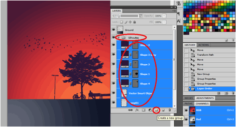
Great! The next stage is to create the silhouette reflection. To do this, we first create a layer group by clicking on the "Create New Layer Group" icon at the bottom of the layers panel. Name this layer "silhouettes". Drag all the silhouette layers into this group to easily manipulate them as a set.
Step 10
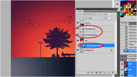
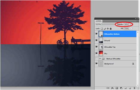
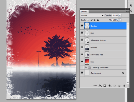
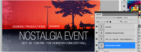
Now, duplicate this group by right clicking on the group and then selecting "duplicate group" in the context menu. Afterwards, right click on the duplicate group and select "Merge Group". This gives us a more easily changeable version of the whole silhouette set. We are keeping the main group as the backup just in case you want to reposition your silhouette shapes. Hide the main group as an initial backup (name it silhouette backup), and then duplicate the merged group (now just a layer) by pressing CTRL+J. Name one duplicate Silhouettes Top, and the other Silhouettes Bottom. In the end, your layers should look something like this:
Step 11
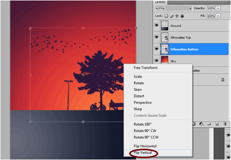
Select the Silhouette bottom layer now and press CTRL+T. Right click on the shape and select the option "Flip Vertical" on the context menu.
Step 12
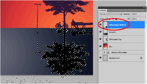
Once the silhouette is flipped, we place the silhouette bottom layer to the lower area of our design, simulating a reflection. We select the whole area of this flipped layer by pressing CTRL and then clicking on its thumbnail image in the layers view. Then we paint the whole area black using the paintbrush tool. We also shifted the position of this layer on top, so that it is on top of our ground layer, and of course fully visible.
Step 13
Finally, we change the opacity value of our silhouette bottom layer so make it more subtle looking as a reflection. Do this by just using a 20-30% value in the opacity setting of this layer at the layers panel.
Step 14
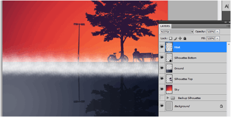
Great! Now, we add a mist effect, to do this, we will need some grunge brushes. We got tons of free ones from this site here. Next, we create a new layer on top of all other layers and we name it "Mist". Then using any of the creative grunge brushes in the collections from that site, we brush in some white across the point of intersection of our design.
Step 15
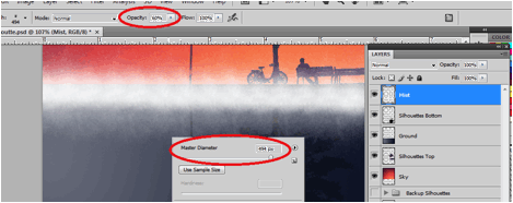
Then, we do the same process all over again. This time, we enlarge the brush to twice its original size. We also change the opacity of the brush to around 60%. Do the same straight stroke across the design.
Step 16
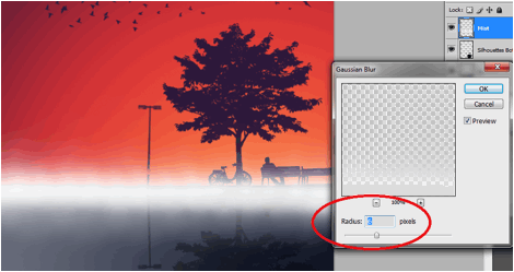
Now, with our mist layer selected, go to Filters -> Blur -> Guassian Blur. In the window that opens, place in a 6 pixel radius. This should finalize our misty transition for the design.
Step 17
Great! Now, we add a border to our flyer. To do this we simply create another new layer and name it "border". Afterwards, using some free brush sets from this site, we splash in some white grunge borders along the edges of our design. Be as creative as possible as you brush around the design. Use different brush shapes whenever possible.
Step 18
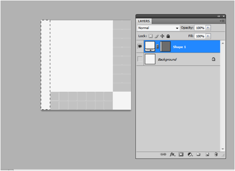
Now, before we actually finish this design, we will first define a pattern. To do this, create a new document by pressing CTRL+N (leave your main design document open). Set the new document to have a 10px by 10px dimension. Create a new layer by pressing CTRL+SHIFT+N. Hide the main background by clicking on its visibility icon in the layers panel. Then draw a one pixel white rectangle at the very leftmost side of this document.
Step 19
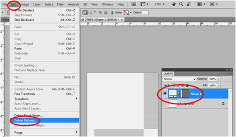
Next, go to the "Edit" option in the menu bar and select the option to "Define Pattern…"
Step 20
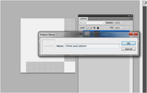
Then, on the window that opens, set the name of your pattern. For our example, we just wrote a simple and highly recognizable pattern name.
Step 21
Now, go back to our original design. Create a new layer here and name it "pattern". Fills this with a black color through the paint bucket tool. Double click on this new layer to access its layer styles and click on the option for "pattern overlay".
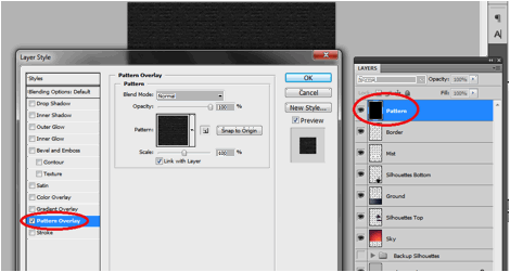
Step 22
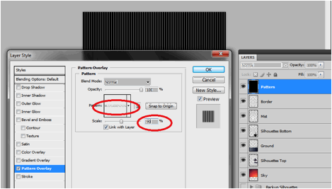
Of course, select the pattern that we just created in the pattern overlay options. Change the scale to around 90% (or test out different values until you get a nice line pattern that you want).
Step 23
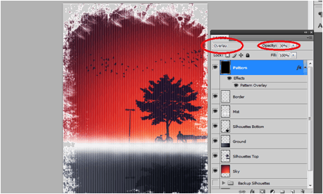
Once done, change the blend mode of this layer to "Overlay" and then reduce the opacity to 30-40%.
Step 24
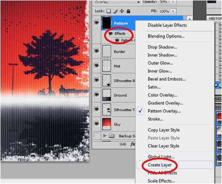
Good, now right click on the effect label of our pattern layer. On the context menu options that appear, select the option to "create layer". This creates a layer out of the pattern we just created.
Step 25
Now, select the two layers that were created by holding down the CTRL key and clicking on the layers. Press CTRL+T to transform them. Rotate them 45 degrees to the side and position them slightly on the right filling a large part of our flyer. Press enter once you are satisfied.
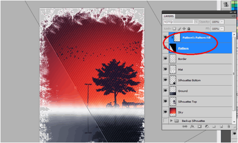
Step 26
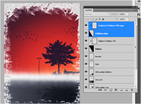
With the layer still selected, right click on them and select "duplicate layers". Position the duplicates to the bottom left side, covering the rest of our flyer. Now, you have the option to leave them like this. However it is best to clean the layers up. Delete the black pattern copies and leave the pattern fills behind. Just make sure you still change the pattern fill's blend mode to overlay at 50% opacity.
Step 27
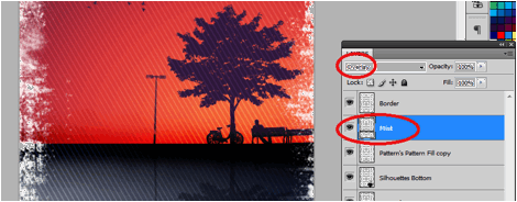
Now, we just will add some final adjustments to our design. First, select the "mist" layer we created earlier. Then press CTRL+I to invert the colors from white to black. Afterwards, change its blend mode to "Overlay".
Step 28
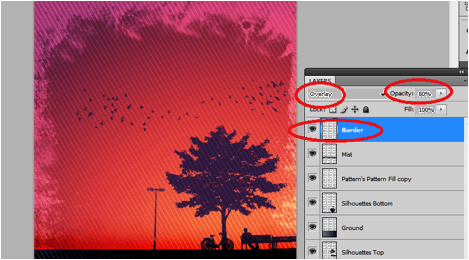
Then we click on the grunge borders layer. We also change its blend mode to overlay, and adjust its opacity to around 80%.
Step 29
Finally we just type in our text for our flyer in white text. Use the type tool of course to add the titles. Sans serif fonts are recommended usually for titles with these designs. Also, vary the size and spacing of your text to add more interesting combinations fo your text content.
Final Image
Once the text is checked and done, your flyer design is finished! Congratulations!
About The Author
Irene Thompson is a professional writer and a graphic designer. She has been addicted to Photoshop for a long time and has been focusing in the area of print design. She works at PrintPlace.com, a trusted online printing company that offers high quality business cards, catalogs, and other powerful printed marketing materials.
*Note: I have used PrintPlace for years, and have always been satisfied with they quality and speed of service for the price. I would recommend them for printing, even if they didn't provide a tutorial.