

 This topic is locked
New Design


Edited by nima, 09 August 2006 - 03:13 PM.
 |

Young Padawan


Posted 09 August 2006 - 03:13 PM
Edited by nima, 09 August 2006 - 03:13 PM.
Young Padawan

Posted 09 August 2006 - 03:25 PM
 i love all of te logos and event the actual logo
P2L Jedi Master

Posted 09 August 2006 - 03:25 PM
P2L Staff

Posted 09 August 2006 - 03:27 PM


Edited by Griffin, 09 August 2006 - 03:47 PM.
Young Padawan
Posted 09 August 2006 - 03:28 PM
P2L Staff
Posted 09 August 2006 - 03:34 PM
Young Padawan

Posted 09 August 2006 - 03:37 PM
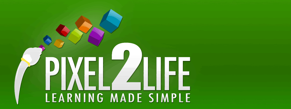
Matty: Would you be able to replace the cursor on your last design with a soft tiped paint brush?
Young Padawan

Posted 09 August 2006 - 03:38 PM
Young Padawan

Posted 09 August 2006 - 03:46 PM

Edited by curthard89, 09 August 2006 - 03:47 PM.
P2L Staff
Posted 09 August 2006 - 03:49 PM
P2L Jedi Master
Posted 09 August 2006 - 03:56 PM
Young Padawan
Posted 09 August 2006 - 04:10 PM
Edited by mattyK, 09 August 2006 - 04:17 PM.
P2L Staff
Posted 09 August 2006 - 04:11 PM
P2L Jedi Master
Posted 09 August 2006 - 04:17 PM
Official Spammer .Matt

Posted 09 August 2006 - 04:32 PM
Young Padawan

Posted 09 August 2006 - 04:47 PM
Young Padawan
Posted 09 August 2006 - 04:50 PM
Edited by nima, 09 August 2006 - 04:50 PM.
Young Padawan
Posted 09 August 2006 - 04:52 PM
Edited by lipsum1992, 09 August 2006 - 04:52 PM.
Young Padawan

Posted 09 August 2006 - 04:53 PM
well, it is a paintbrush, but I prefer the cursor
White Paintbrush
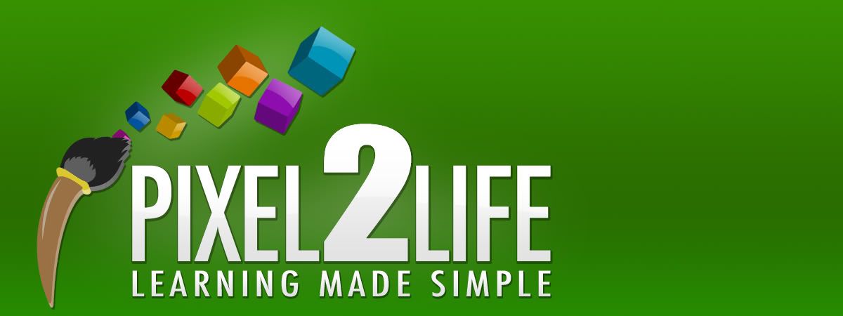
Color Paintbrush
Young Padawan

Posted 09 August 2006 - 05:54 PM
LEARN Smth!

nice, isn't it?


0 members, 0 guests, 0 anonymous users


