


 This topic is locked
Nothingman VS Mattyk!
lol
Great fight guys!
Nothingman did you draw these by hand first?
your last 3 post are leally great
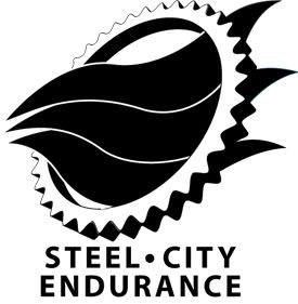
(in your last one you could use a better font for SCE though)


$50 Logo Competition: Steel City Endurance
Started by
AdventureBear
, Sep 11 2006 05:23 PM
91 replies to this topic
#62

NothingMan
-

- Members
-

- 132 posts
Young Padawan
- Location:Banovici, Bosna i Hercegovina
- Interests:Im a logo designer, my expertise is branding. I do templates too, but I suck at coding :). I do little photography as well...:)<br />Thats all
Posted 19 September 2006 - 08:06 AM
Nothingman VS Mattyk!
lol
Great fight guys!
Nothingman did you draw these by hand first?
your last 3 post are leally great
(in your last one you could use a better font for SCE though)
Thanks

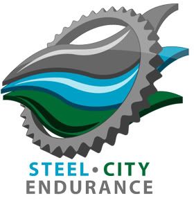
Yeah I know, I finished it last night (actually It was morning
) so I didnt have time, I shall certainly do some variations with other fonts...Yeah, idea came to me yesterday while I was in a bar drinking beer:), so i drew it on paper
A new one:
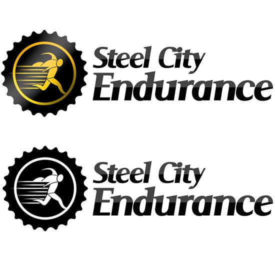
Edited by NothingMan, 19 September 2006 - 10:59 AM.
#63
AdventureBear
-
- Members
-
- 41 posts
Young Padawan
Posted 19 September 2006 - 11:18 AM
Nothingman VS Mattyk!
lol
Great fight guys!
Nothingman did you draw these by hand first?
your last 3 post are leally great
(in your last one you could use a better font for SCE though)
You're killing me nothing man, these are great. very nice. I've been walking around town looking at people's tshirts seeing "my" logo on them...
#64
NothingMan
-
- Members
-
- 132 posts
Young Padawan
- Location:Banovici, Bosna i Hercegovina
- Interests:Im a logo designer, my expertise is branding. I do templates too, but I suck at coding :). I do little photography as well...:)<br />Thats all
Posted 19 September 2006 - 12:11 PM
Thanks 
Probably last for today
Probably last for today
#65
mattyK
-

- Members
-
- 201 posts
Young Padawan
- Location:Surrey, BC, Canada
- Interests:Graphic Design, Soccer, Hockey, Guitar, CKY
Posted 19 September 2006 - 06:20 PM
I don't know how you find this much time... I just came home to a crapload of your entries... looks like I've gotta get to work...
EDIT:
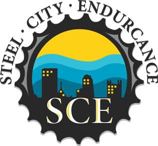
Here's my first attempt at a more circular style of logo...
edit 2... why waist a perfectly good second post?
Here's another concept... it's supposed to represent street, water, and land (I know you probably don't run on grass but I didn't want to go street water street...)
and in monotone
Alrighty I'm done for the night (still got other logo stuff to do)
EDIT:
Here's my first attempt at a more circular style of logo...
edit 2... why waist a perfectly good second post?
Here's another concept... it's supposed to represent street, water, and land (I know you probably don't run on grass but I didn't want to go street water street...)
and in monotone
Alrighty I'm done for the night (still got other logo stuff to do)
Edited by mattyK, 19 September 2006 - 09:57 PM.
#66
AdventureBear
-
- Members
-
- 41 posts
Young Padawan
Posted 20 September 2006 - 02:33 AM
You guys blow my mind. I'm going to need to get outside help on deciding!
#67
Matheus
-

- Members
-
- 1,058 posts
P2L Jedi Master
- Gender:Not Telling
Posted 21 September 2006 - 12:28 PM
mattyk, this entrie is awsome, I think it's your best entire
the circle thing isn't very iconic but the land sreet and water in the wheel is very good.
the circle thing isn't very iconic but the land sreet and water in the wheel is very good.
Edited by Myoto, 21 September 2006 - 12:34 PM.
#68
NothingMan
-
- Members
-
- 132 posts
Young Padawan
- Location:Banovici, Bosna i Hercegovina
- Interests:Im a logo designer, my expertise is branding. I do templates too, but I suck at coding :). I do little photography as well...:)<br />Thats all
Posted 21 September 2006 - 12:38 PM
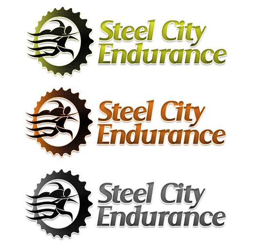
Another idea...
#69
Matheus
-
- Members
-
- 1,058 posts
P2L Jedi Master
- Gender:Not Telling
Posted 21 September 2006 - 06:53 PM
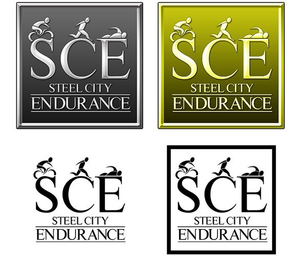
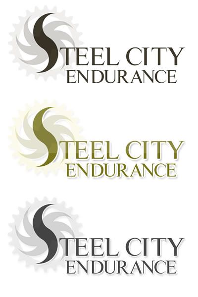
another one, more simple with an idea of logo like Adidas, Nike, Puma, and others have

and a bw version

and a bw version
Edited by Myoto, 21 September 2006 - 07:21 PM.
#70
mattyK
-
- Members
-
- 201 posts
Young Padawan
- Location:Surrey, BC, Canada
- Interests:Graphic Design, Soccer, Hockey, Guitar, CKY
Posted 21 September 2006 - 07:09 PM
mattyk, this entrie is awsome, I think it's your best entire
the circle thing isn't very iconic but the land sreet and water in the wheel is very good.
Thanks
#71
NothingMan
-
- Members
-
- 132 posts
Young Padawan
- Location:Banovici, Bosna i Hercegovina
- Interests:Im a logo designer, my expertise is branding. I do templates too, but I suck at coding :). I do little photography as well...:)<br />Thats all
Posted 23 September 2006 - 11:51 AM
Whats happening?!
#72
Matheus
-
- Members
-
- 1,058 posts
P2L Jedi Master
- Gender:Not Telling
Posted 23 September 2006 - 06:36 PM
competitions worth more then simple money my friend: whoever wins this one will get alot of recoginition for the simple fact of win from future-sucessful designers like mattyk, nothingman, alterbox and other people (sorry if I fortgot someones name)
So, it's like: the 50$ is just a encouragement to people participate.
So, it's like: the 50$ is just a encouragement to people participate.
#73
AdventureBear
-
- Members
-
- 41 posts
Young Padawan
Posted 23 September 2006 - 11:15 PM
competitions worth more then simple money my friend: whoever wins this one will get alot of recoginition for the simple fact of win from future-sucessful designers like mattyk, nothingman, alterbox and other people (sorry if I fortgot someones name)
So, it's like: the 50$ is just a encouragement to people participate.
Well, don't forget that I physically came to your houses and twisted your arms and forced you to spend lots of time on designing entries! (sarcasm intended).
Whoever feels like winning $50 will spend as much time as they think is appropriate on it. If $50 isn't worth it, then you obviously won't enter. If you are just in it to have fun at designing new ideas then have at it.
Ignore the troll anyway.
So the comp is between NothingMan and MattyK, and even at that they both have several great entries. I am getting together with a friend this week to sit down and go over them. The comp was supposed to run until Oct 1st, so we are still on track. If there are more entries we'll look at them, but as it stands there are plenty to choose from.
Thank you all for your participation and time! (except the troll).
-Suzanne
#74
Matheus
-
- Members
-
- 1,058 posts
P2L Jedi Master
- Gender:Not Telling
Posted 23 September 2006 - 11:24 PM
 the competition is between just both? so, should everyone else just quit and give up? well, I think the competition just ends when it's over, so... I'll keep trying.
#75
mattyK
-
- Members
-
- 201 posts
Young Padawan
- Location:Surrey, BC, Canada
- Interests:Graphic Design, Soccer, Hockey, Guitar, CKY
Posted 24 September 2006 - 12:30 AM
I think she's hinting at styles she likes (use it to your advantage)
But, unless somebody comes out with something that makes even me say WOW!, I'm happy with my current entries... I might make 1 more.
#76
AdventureBear
-
- Members
-
- 41 posts
Young Padawan
Posted 24 September 2006 - 12:35 AM
Not necessarily, I just wanted to give people some idea of what I was thinking. But at this point, my favorites are between those two. Myoto, your designs are third.
I would love to continue to see new ideas. People seem to be slowing down a bit and I've provided a lot of feedback for what's been posted. I initally thought that MattyK's city skyline was "THE ONE", but then the additional entries were pretty good. I'm now more attracted to the more circular logos, so Matty's original city skyline has taken a backseat, even though it's a fantastic design. I may actually contact some of you guys to use your desings in other ways even if you don't "win" the competition.
My friend's father thinks that a lot of the designs look too much like the Rotary International logo, but I don't totally agree. I mean, a gear is a gear (sort of), but I really like the looks of the sprockets and don't think that any of my potential clients will be confused by that.
So...keep the ideas coming if you still got em. I'll keep posting likes/dislikes to help generate more ideas, and if you think it's worht $50 (LOL), or just enjoy designing, keep posting!
Hope that helps Myoto.

#77
Donna
-

- P2L Staff
-
- 12,330 posts
Retired P2L Queen!
- Gender:Female
- Location:B.C Canada
Posted 24 September 2006 - 12:52 AM
MEMO To Trolls:
This is not directed towards to any member in this thread.
I have removed a comment from this topic (AdventureBear is also aware of this) and a few that followed after so this thread is back on topic.
If you have no intentions of entering and just trolling and making silly comments your account will be instantly banned.
This Forum is Competition Free-For-All to take part in the friendly contests and work on your skills, whether prizes are offered or not. $2 or $1000.00 if your not paying the prize monies or entering it's really no concern to anyone to tell other members they are wasting their time and efforts.
If you have a complaint on any competition and feel members are wasting their time please send them directly to Dan via our contact page otherwise keep them to yourself.
 Thanks and good luck to those entering in this.
Don't reply to this please
This is not directed towards to any member in this thread.
I have removed a comment from this topic (AdventureBear is also aware of this) and a few that followed after so this thread is back on topic.
If you have no intentions of entering and just trolling and making silly comments your account will be instantly banned.
This Forum is Competition Free-For-All to take part in the friendly contests and work on your skills, whether prizes are offered or not. $2 or $1000.00 if your not paying the prize monies or entering it's really no concern to anyone to tell other members they are wasting their time and efforts.
If you have a complaint on any competition and feel members are wasting their time please send them directly to Dan via our contact page otherwise keep them to yourself.
Thanks and good luck to those entering in this.Don't reply to this please
#78
NothingMan
-
- Members
-
- 132 posts
Young Padawan
- Location:Banovici, Bosna i Hercegovina
- Interests:Im a logo designer, my expertise is branding. I do templates too, but I suck at coding :). I do little photography as well...:)<br />Thats all
Posted 24 September 2006 - 02:52 AM
Not necessarily, I just wanted to give people some idea of what I was thinking. But at this point, my favorites are between those two. Myoto, your designs are third.
I would love to continue to see new ideas. People seem to be slowing down a bit and I've provided a lot of feedback for what's been posted. I initally thought that MattyK's city skyline was "THE ONE", but then the additional entries were pretty good. I'm now more attracted to the more circular logos, so Matty's original city skyline has taken a backseat, even though it's a fantastic design. I may actually contact some of you guys to use your desings in other ways even if you don't "win" the competition.
My friend's father thinks that a lot of the designs look too much like the Rotary International logo, but I don't totally agree. I mean, a gear is a gear (sort of), but I really like the looks of the sprockets and don't think that any of my potential clients will be confused by that.
So...keep the ideas coming if you still got em. I'll keep posting likes/dislikes to help generate more ideas, and if you think it's worht $50 (LOL), or just enjoy designing, keep posting!
Hope that helps Myoto.
Well I had a new idea 3 days ago, but I just cant get it right. Seems Im having designers block :wacko:
But Ill sure get over it until OCTober 1st
...Good Luck ya all
#79
Daniel D
-

- Members
-
- 115 posts
Young Padawan
Posted 26 September 2006 - 06:49 AM
Ok well I decided I wasn't going to enter this one due to lots and lots of problems going on atm, 1 being the loss of my nephew.
I love the logos all of you are putting out and I hope you all had fun making them!
Good luck to all of you who entered.
@Donna Thanks for the post you made.. I got really confused reading this last page.
I love the logos all of you are putting out and I hope you all had fun making them!
Good luck to all of you who entered.
@Donna Thanks for the post you made.. I got really confused reading this last page.
#80
NothingMan
-
- Members
-
- 132 posts
Young Padawan
- Location:Banovici, Bosna i Hercegovina
- Interests:Im a logo designer, my expertise is branding. I do templates too, but I suck at coding :). I do little photography as well...:)<br />Thats all
Posted 26 September 2006 - 12:06 PM
Ok well I decided I wasn't going to enter this one due to lots and lots of problems going on atm, 1 being the loss of my nephew.
I love the logos all of you are putting out and I hope you all had fun making them!
Good luck to all of you who entered.
@Donna Thanks for the post you made.. I got really confused reading this last page.
Sorry to hear that....


0 user(s) are reading this topic
0 members, 0 guests, 0 anonymous users

