For the coins yes it could cause it's symbolise money but i was speaking about the addition to globe ( you said that basket or cart is better than a globe or a clock)
if i said that i thought that it was a good melted symbol it's because i try to think to the user.
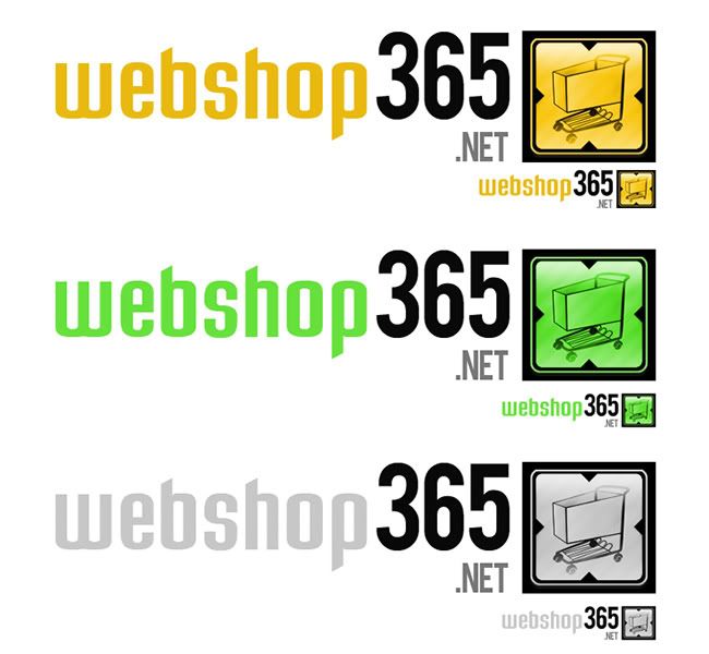
What can make someone choose to set up an e-shop ?
if one day i choose to do so it'll be because :
- i want to sell something (for money)
- i want to sell it online cause theres no closed shop wich can maximse profits
money appears me to be the leading idea and internet and online network like the second one
so coins for money and globe for internet and money on front globe in the back
i'm not saying that a basket or a cart cannot make me think about webshopping cause it will be false smile.gif
but i feel a difference between:
a site wich have multiple products to sell
a site wich sell the solution to sell those products
wait and see 
I believe you may have over thought this one a little...
All people want to see is organization and a logo that looks simple and recognizable, that flows well with the website that it's marketing for.
A first time user wants to see that the people they're dealing with know what they're doing, because if you're going to a site called webshop365.net, you're either a misguided shopper (in which case you'll leave anyway) or you're looking to start your own shop, in which case the logo message won't mean nearly as much as it's function as a design element of the website.
A user that has been to your site before just needs to remember the brand, whether they recognize the colours somewhere, they hear the words web shop, it doesn't matter, as long as they remember. Word of mouth advertising is the most efficient advertising (In my opinion at least) as you're getting advice from somebody you trust, or at least know of.
That's why for your next attempt I would recommend trying something that reflects more on the appeal of the logo, rather than the message it portrays.
But don't get me wrong, I'm just trying to help, and sorry if I sound a little obnoxious.

Edited by mattyK, 10 September 2006 - 10:05 PM.


 This topic is locked